
You are building a production dashboard to monitor a newly deployed recommendation model. You need to display both the model's prediction accuracy (measured as a percentage) and its inference latency (measured in milliseconds) over a 30-day period on a single chart to help the team spot correlations, such as accuracy drops during high-latency periods. Which visualization style is best suited for this task?
Select an answer to reveal the explanation.
Short Explanation
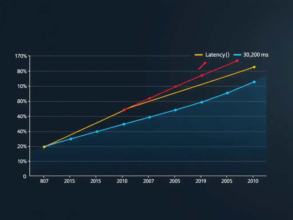
You want to see if your model gets dumber when it gets slower, but accuracy percentages and latency milliseconds don't share a scale. Use a dual-axis line chart with time on the horizontal axis, accuracy on the left vertical axis, and latency on the right vertical axis. Now you can spot correlations without one line flattening out.
Full Explanation
Monitoring models in production requires visualizing multiple metrics to identify performance degradation, such as model drift or resource bottlenecks. Accuracy, ranging from 0% to 100%, and latency, measured in milliseconds or seconds, have completely different scales and units. A dual-axis line chart is the ideal visualization for this scenario because it plots two distinct metrics against a shared independent variable, time, using two separate vertical axes: accuracy on the primary vertical axis and latency on the secondary vertical axis. This allows users to easily view trends, detect anomalies, and identify temporal correlations, such as latency spikes coinciding with accuracy drops, without scale distortion. A box plot comparing statistical spreads is useful for showing data distribution and outliers but discards the chronological sequence, making it impossible to track trends over time. A stacked area chart displaying cumulative sums adds the values together, which is mathematically nonsensical for percentage accuracy and millisecond latency. A pie chart illustrating percentage distribution of latency intervals shows parts of a whole at a single point in time, which cannot display temporal trends. Therefore, the dual-axis line chart is the most effective choice.