After performing exploratory data analysis on a complex multidimensional dataset for a new AI project, you need to present your findings to corporate stakeholders to guide their strategic decisions. Which two visualization approaches are most effective for conveying multidimensional patterns and allowing stakeholders to explore the data dynamically? (Select two)
Select all correct answers, then click Submit.
Short Explanation and Infographic
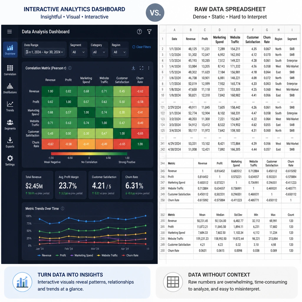
Here's the deal: you've done all the hard work mining this massive dataset, and you've found some gold. But if you walk into the boardroom and hand your boss a 50-page printout of raw numbers or a single, confusing pie chart, they're going to glaze over in about ten seconds. Not what you want! You need visualizations that tell a story but also let people dig deeper if they have questions. First, use a heatmap. It uses colors to show correlations between variables, so anyone can instantly spot where the strong relationships are without reading a single equation. Second, build an interactive dashboard in Power BI or Tableau. This lets your stakeholders click around, filter by region or product, and answer their own questions in real time. It turns a static presentation into an interactive conversation, and that is how you get buy-in!
Full explanation below image
Full Explanation
Presenting data-driven insights from complex, multidimensional datasets to stakeholders requires visualization techniques that compress complexity without losing critical context, while supporting interactive exploration. The two most effective approaches for this are: 1. Correlation Heatmaps: A heatmap uses a color-coded matrix to display the strength of relationships (correlation coefficients) between multiple pairs of variables. This allows viewers to instantly identify positive, negative, or neutral relationships across dozens of features simultaneously. For stakeholders, it highlights which factors are strongly linked (e.g., customer behavior vs. sales volume) without requiring them to parse dense statistical tables. 2. Interactive Dashboards (e.g., Tableau, Power BI): Static charts only answer a single pre-defined question. Interactive dashboards enable stakeholders to filter, drill down, and segment the data dynamically. This interactivity supports self-service business intelligence, allowing users to customize their views to answer specific business questions and explore different scenarios on the fly.
Let's evaluate why the other options are less effective: - Raw spreadsheets provide complete detail but fail to summarize patterns, making it extremely difficult for non-technical stakeholders to draw meaningful, actionable conclusions. - A single static pie chart is incapable of representing multidimensional correlations and becomes unreadable when crammed with more than a few categories. - A simple line chart only shows a single trend over time, failing to capture the complex interdependencies and correlations present in a multidimensional dataset.