
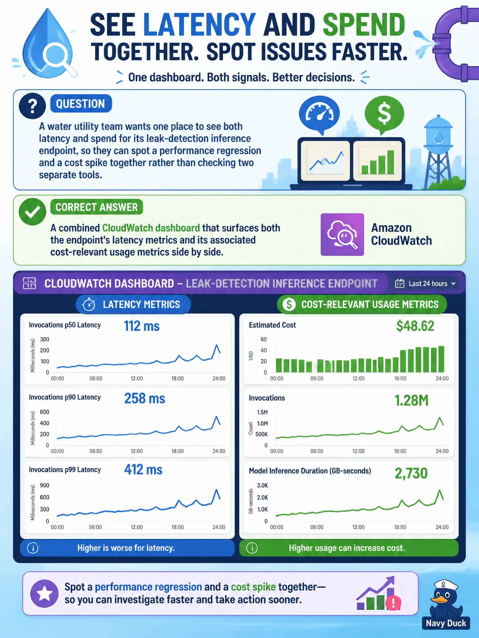
A water utility team wants one place to see both latency and spend for its leak-detection inference endpoint, so they can spot a performance regression and a cost spike together rather than checking two separate tools. What should they build?
Select an answer to reveal the explanation.
Short Explanation
Checking latency in one place and cost in another means a regression and a cost spike can both be happening and nobody notices they're related until much later. A combined CloudWatch dashboard puts latency metrics and cost-relevant usage side by side, so a slowdown and a spend jump show up together on one screen. That's what makes the connection between the two visible instead of buried across two separate tools.
Full Explanation
A combined CloudWatch dashboard pulls both latency metrics and cost-relevant usage metrics, like invocation count, instance utilization, or data processed, into one view, letting the team visually correlate a performance regression with a cost spike as they happen, rather than reconstructing that connection after the fact from two disconnected sources. Maintaining two separate, unrelated dashboards, including a manually updated spreadsheet, reintroduces exactly the fragmentation the team is trying to solve, and a manually maintained spreadsheet is also prone to going stale. A single latency-only alarm covers performance monitoring but leaves cost tracking as a manual, infrequent task, meaning a cost spike could run for weeks before anyone notices it during a monthly review. A CloudTrail-based dashboard is built for auditing who called the API and when, not for visualizing latency trends or cost-relevant usage metrics, so it doesn't serve either goal here. Scope caveat: a combined dashboard is a visualization convenience, not an alerting mechanism by itself, so the team should still configure alarms on the metrics that matter most rather than relying on someone watching the dashboard. A concrete operational check: confirm the dashboard's cost-relevant metrics and latency metrics share a common time axis so a correlated spike is visually obvious.