
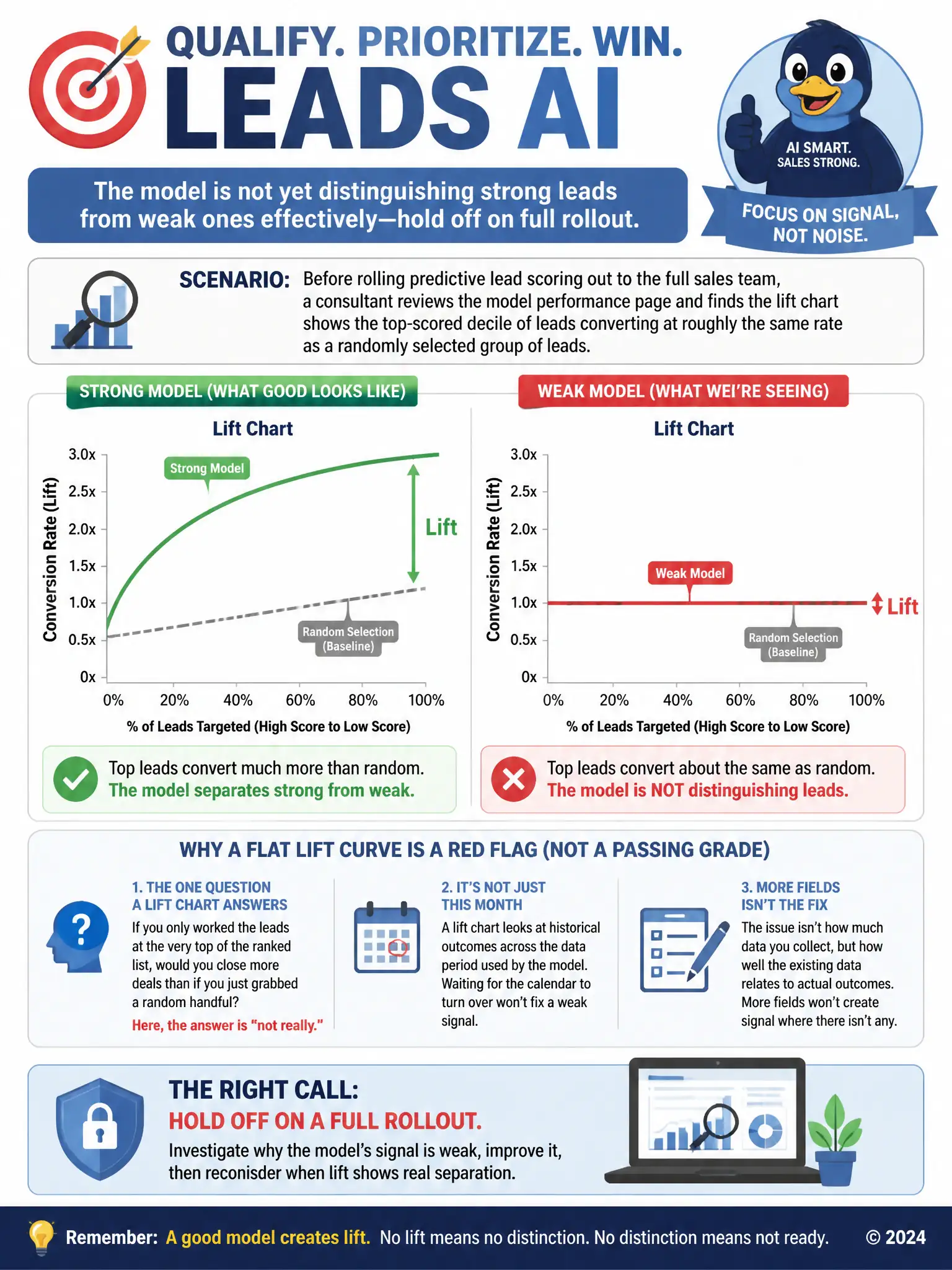
Before rolling predictive lead scoring out to the full sales team, a consultant reviews the model performance page and finds the lift chart shows the top-scored decile of leads converting at roughly the same rate as a randomly selected group of leads. What should the consultant conclude?
Select an answer to reveal the explanation.
Short Explanation
A lift chart asks whether the top-scored leads convert better than a random handful. If the top decile converts about the same as random leads, the model isn't separating strong leads from weak ones yet. You shouldn't roll it out fully until the scoring improves.
Full Explanation
The correct conclusion is that the model is not yet distinguishing strong leads from weak ones effectively, and the client should hold off on a full rollout until scoring improves. A useful predictive model should separate strong leads from weak ones, and a lift chart demonstrates that by showing whether the highest-scored group converts meaningfully better than a random sample. When the top decile converts at roughly the same rate as chance, the model is not yet finding a reliable signal, so pausing the full rollout until performance improves protects the sales team from chasing a prioritized list that is no better than working leads in any order. The idea that the model is performing well because a flat lift curve means every lead has an equal opportunity to convert is incorrect because a flat lift curve is the opposite of good performance; it indicates the model is not differentiating leads at all, not that every lead has been fairly and accurately evaluated. The idea that the lift chart only reflects data from the current calendar month is incorrect because the lift chart is not artificially restricted to the current calendar month, and waiting for month-end would not change a fundamentally flat result caused by weak training signal. The idea that the flat curve confirms the model needs more picklist fields added to the lead form is incorrect because adding more picklist fields does not address the diagnosis; the issue the lift chart reveals is about the strength of the relationship between existing data and outcomes, not the quantity of fields captured on the form. The consultant should investigate training data quality and volume before recommending a broader rollout.