
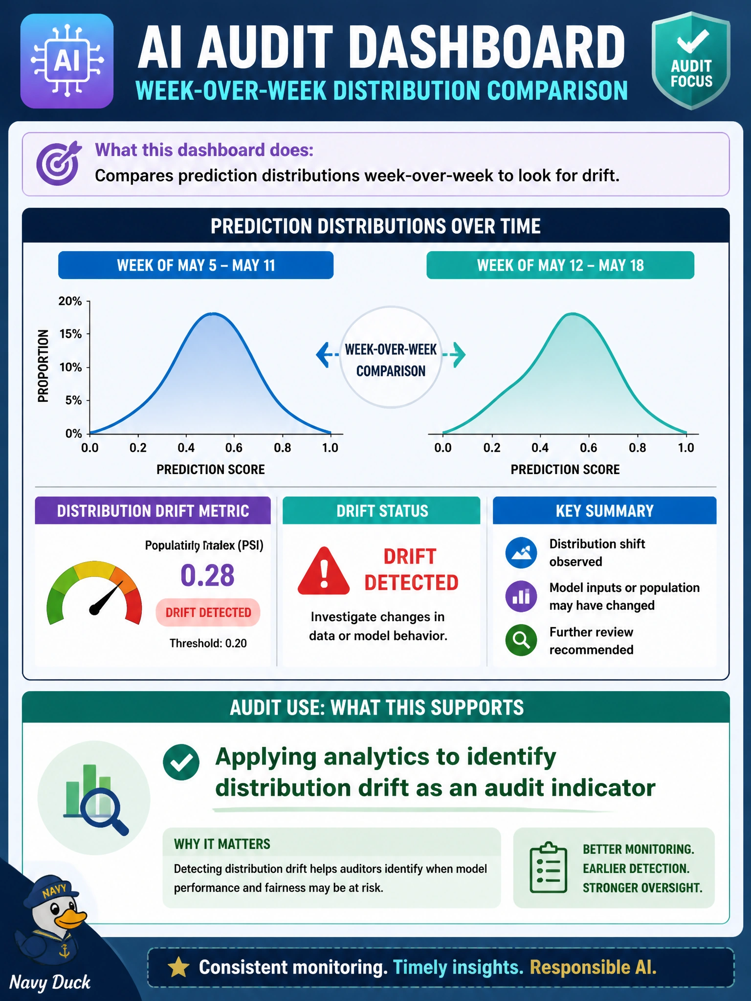
A public-health AI audit dashboard compares prediction distributions week-over-week to look for drift. What audit use does this support?
Select an answer to reveal the explanation.
Short Explanation
Week-to-week prediction shifts are a drift smoke alarm for auditors. Spot the change, then dig — don't just admire the chart. You're not using this dashboard to test fairness across demographic subgroups.
Full Explanation
Week-over-week comparison of prediction distributions on a public-health AI dashboard supports applying analytics to identify distribution drift as an audit indicator. Shifts in score or class distributions can signal data change, upstream process change, or model degradation before outcome metrics fully deteriorate. Auditors use such drift indicators to target follow-up tests on clinic-facing models rather than waiting solely for annual fieldwork.
Testing prediction fairness across demographic subgroups to detect potential bias issues is a separate equity analysis; the dashboard compares aggregate prediction distributions over time rather than evaluating subgroup disparities. Validating model calibration against current observed clinical outcome review data requires comparing predictions to actual outcomes, which goes beyond simply tracking week-over-week shifts in prediction distributions. Recording detailed training data lineage to support audit traceability reviews is a documentation control, not the direct audit use served by comparing live prediction distributions for drift.
Exam caveat: not every distribution shift is harmful drift—seasonality and legitimate population change can move curves—so thresholds and contextual review matter. Operational check: define baseline distributions and alert thresholds for the public-health model, document investigations of breaches, and link confirmed drift events to data or model change tickets in the audit trail.