
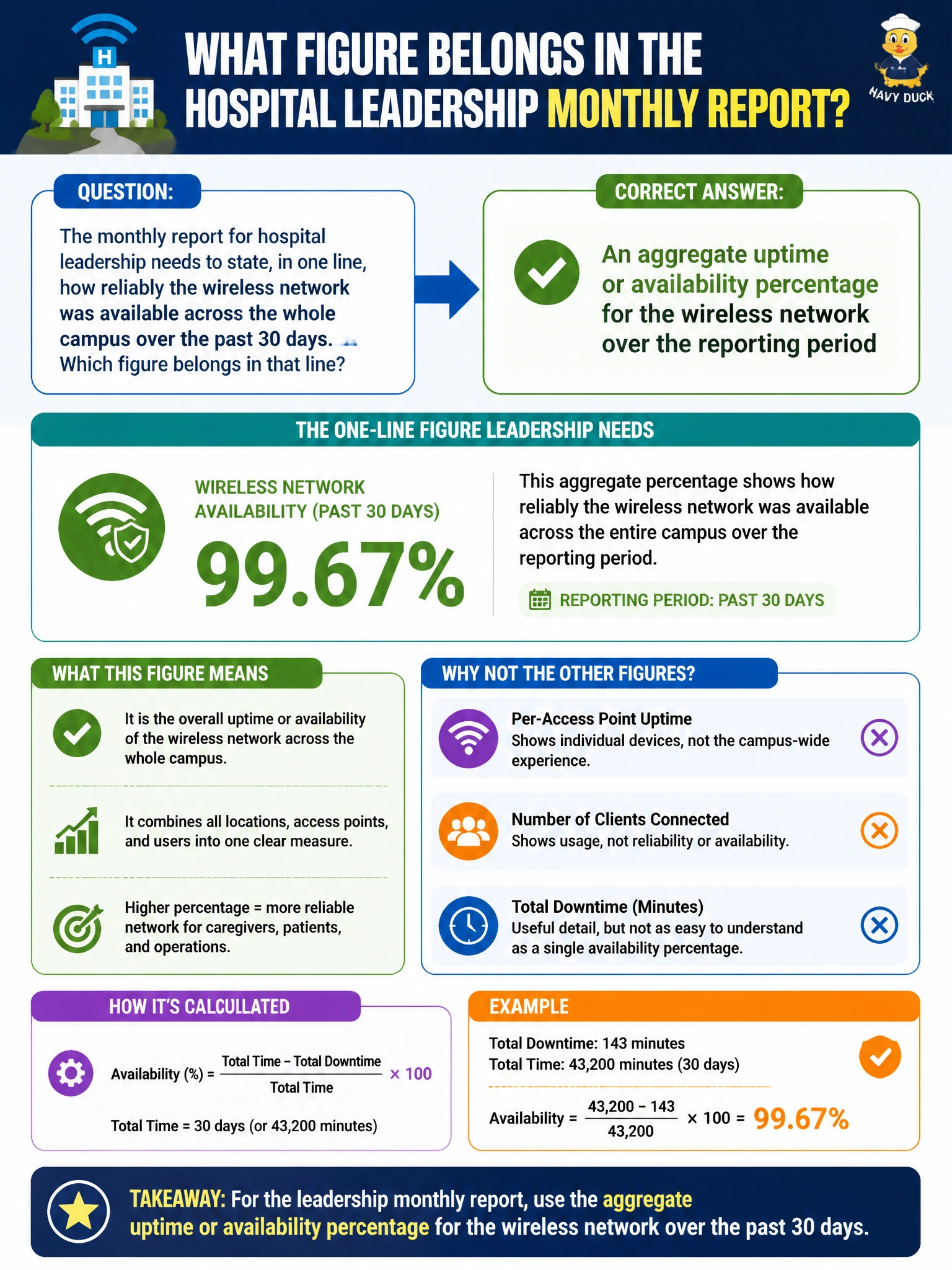
The monthly report for hospital leadership needs to state, in one line, how reliably the wireless network was available across the whole campus over the past 30 days. Which figure belongs in that line?
Select an answer to reveal the explanation.
Short Explanation
Leadership wants one number that answers "how reliable were we," and that's what an uptime percentage does — it rolls a whole month into a single figure, the same way a report card rolls a semester's work into one grade.
Full Explanation
A one-line reliability statement for a 30-day period calls for an aggregate availability or uptime percentage, since that figure summarizes how much of the reporting window the wireless network was functioning within acceptable parameters, which is precisely what a leadership audience needs without wading into device-level detail. A snapshot of how many access points are online right now describes only the current instant, not reliability across an entire month, and could look perfectly fine even after a bad outage the week before. A count of total connecting client devices measures usage and demand, not reliability; a network could have handled a huge number of unique clients while still suffering outages, so the two numbers are not interchangeable. The count of firmware updates applied during the month is an operational maintenance activity log, useful in its own report but silent on whether the network was actually available to users during that time. Choosing the right summary figure matters because a leadership report is judged on whether the one number it leads with actually answers the question being asked, and none of the other candidates measure reliability over time the way an aggregate availability percentage does. A useful check before publishing that figure is to confirm which outages, if any, were excluded as planned maintenance windows, since that inclusion or exclusion changes the number leadership will see.