
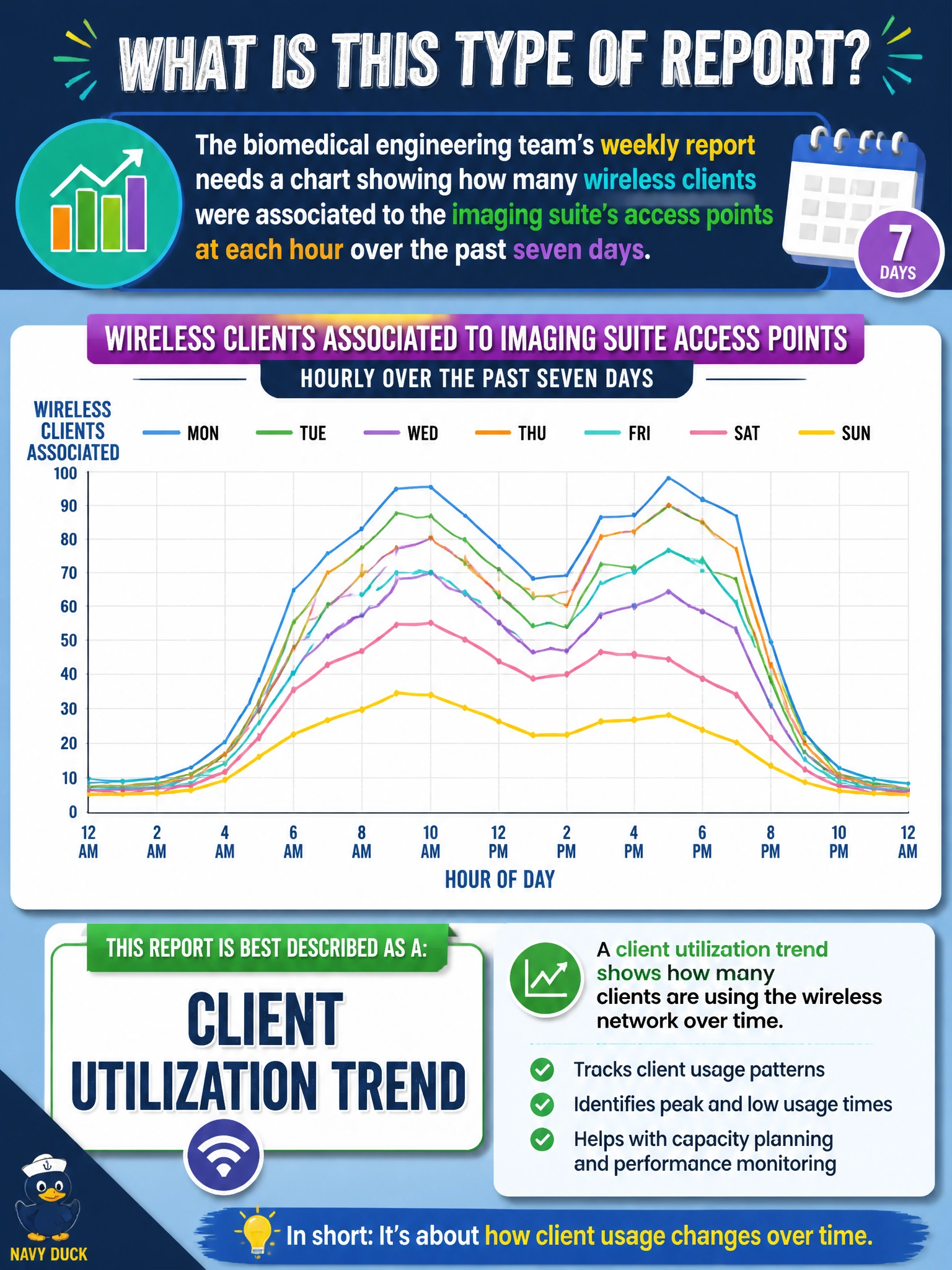
The biomedical engineering team's weekly report needs a chart showing how many wireless clients were associated to the imaging suite's access points at each hour over the past seven days. What is this type of report best described as?
Select an answer to reveal the explanation.
Short Explanation
This chart is answering "how busy does it get, and when?" — that's a utilization trend, plain and simple. Picture a heartbeat monitor's trace over a week instead of one single reading: it's the pattern over time that tells the real story.
Full Explanation
A chart plotting associated client counts hour by hour over a week is a client utilization trend, because it captures how demand on a set of access points rises and falls over time rather than describing a single point-in-time state, which is exactly the kind of view a report uses to show, for example, a predictable midday peak in the imaging suite tied to shift changes. A roaming report is genuinely about clients, but it counts handoff events between access points and how long each took, answering whether mobility is smooth rather than how many devices were present at a given hour. An application usage breakdown also trends over time, but its unit is traffic by application, so it tells you what the imaging suite's clients were doing, not how many of them were associated. An availability and uptime summary tracks the state of the access points themselves, so a suite of APs can report 100 percent uptime for the week while serving wildly different client loads hour to hour. Recognizing which bucket a given report output belongs to matters because each type answers a different operational question and gets requested by a different audience for a different reason. A useful check before publishing this kind of trend is to confirm the sampling interval is consistent across the full week, since gaps or uneven intervals can make an otherwise normal pattern look like a sudden spike or drop.