
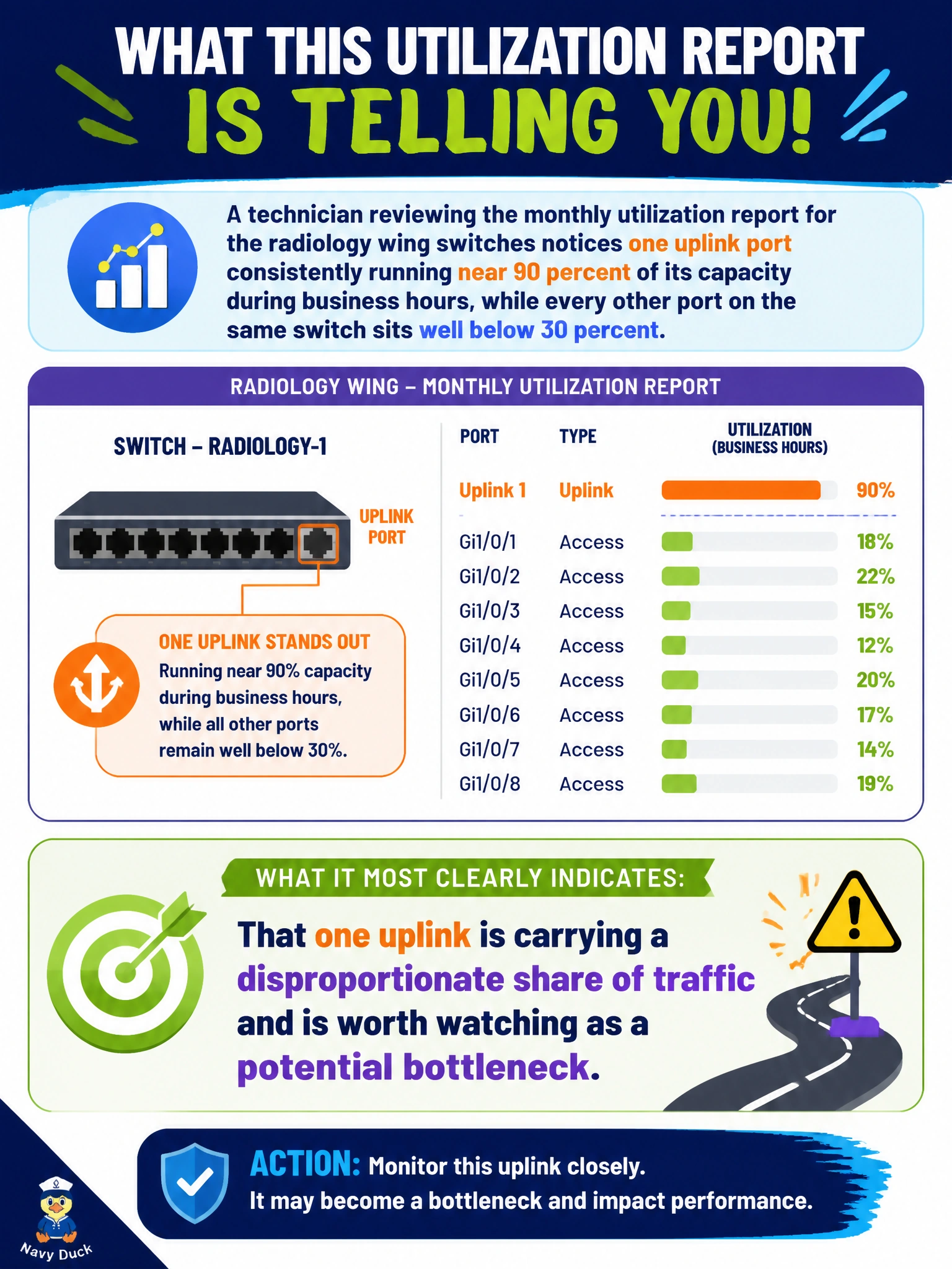
A technician reviewing the monthly utilization report for the radiology wing switches notices one uplink port consistently running near 90 percent of its capacity during business hours, while every other port on the same switch sits well below 30 percent. What does this specific reporting pattern most clearly indicate?
Select an answer to reveal the explanation.
Short Explanation
Uneven load across ports isn't a red flag by itself — it's just how networks actually work. An uplink carries traffic funneled in from many access ports, so of course it runs hotter than any single downstream port. Think of it like a highway on-ramp versus a side street.
Full Explanation
A utilization report showing one uplink port running much hotter than access ports on the same switch is describing entirely expected behavior, because an uplink aggregates traffic from every downstream port on that switch, so it naturally carries far more load than any single edge connection. Running near 90 percent during business hours is meaningful and worth watching as a potential bottleneck for future growth, since sustained high utilization on the one path all traffic must cross can eventually cause queuing delays or drops, but it is not itself proof the switch is malfunctioning. Concluding the switch is failing conflates high utilization with a fault condition; utilization and hardware health are measured by different indicators, and a busy but healthy uplink shows no other failure symptoms. Assuming all ports should read identically misunderstands network topology entirely, since access ports and uplink ports serve structurally different roles and are expected to carry very different traffic volumes. Calling it a reporting bug is the wrong conclusion for the exact same reason: the pattern is exactly what a healthy, correctly functioning switch looks like. The useful next step for the report is simply to track that uplink's trend over successive months to see whether the utilization is climbing toward true saturation.