
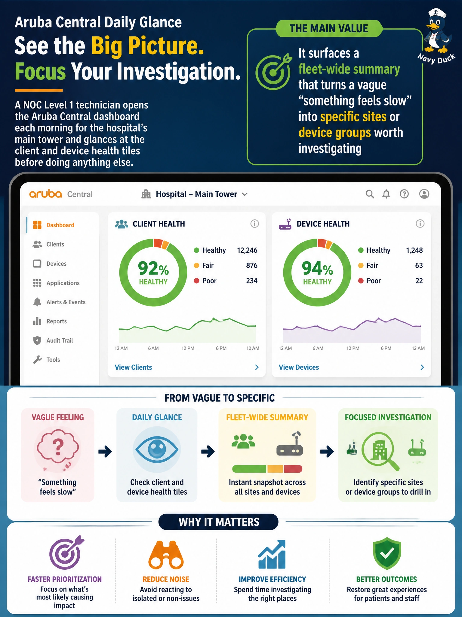
A NOC Level 1 technician opens the Aruba Central dashboard each morning for the hospital's main tower and glances at the client and device health tiles before doing anything else. What is the main value of that daily glance, before drilling into any single device?
Select an answer to reveal the explanation.
Short Explanation
Think of the dashboard like the vitals board at a nurses' station: it doesn't treat anyone, but it tells you at a glance who needs attention first. A quick daily look turns a fuzzy sense that something's off into a short list of sites or device groups worth checking. It doesn't fix anything, and it doesn't promise everything is fine either.
Full Explanation
Aruba Central's health tiles compress fleet-wide status into one view, so a technician can tell within seconds whether the network as a whole looks normal or whether a site, floor, or device group is trending away from its usual pattern. That summary is what turns a vague complaint like "the network feels slow this morning" into an actionable starting point, such as a particular ward or switch group showing degraded radios or rising client issues, which the technician can then drill into. The dashboard is an observation tool, not a remediation tool, so the options describing automatic firmware updates or automatic rewriting of the WLAN configuration confuse monitoring with making changes. The option claiming the glance confirms every client and device is healthy is wrong because an aggregate view can look green while an individual client or device still has a problem, and a summary is a starting point for investigation rather than a clean bill of health. For the exam, associate summary health views with triage and prioritization, not with configuration or proof that nothing is wrong. A useful operational check is to compare today's tile colors and counts with a saved baseline from a normal day, since a dashboard only tells you something changed if you know what normal looked like.