
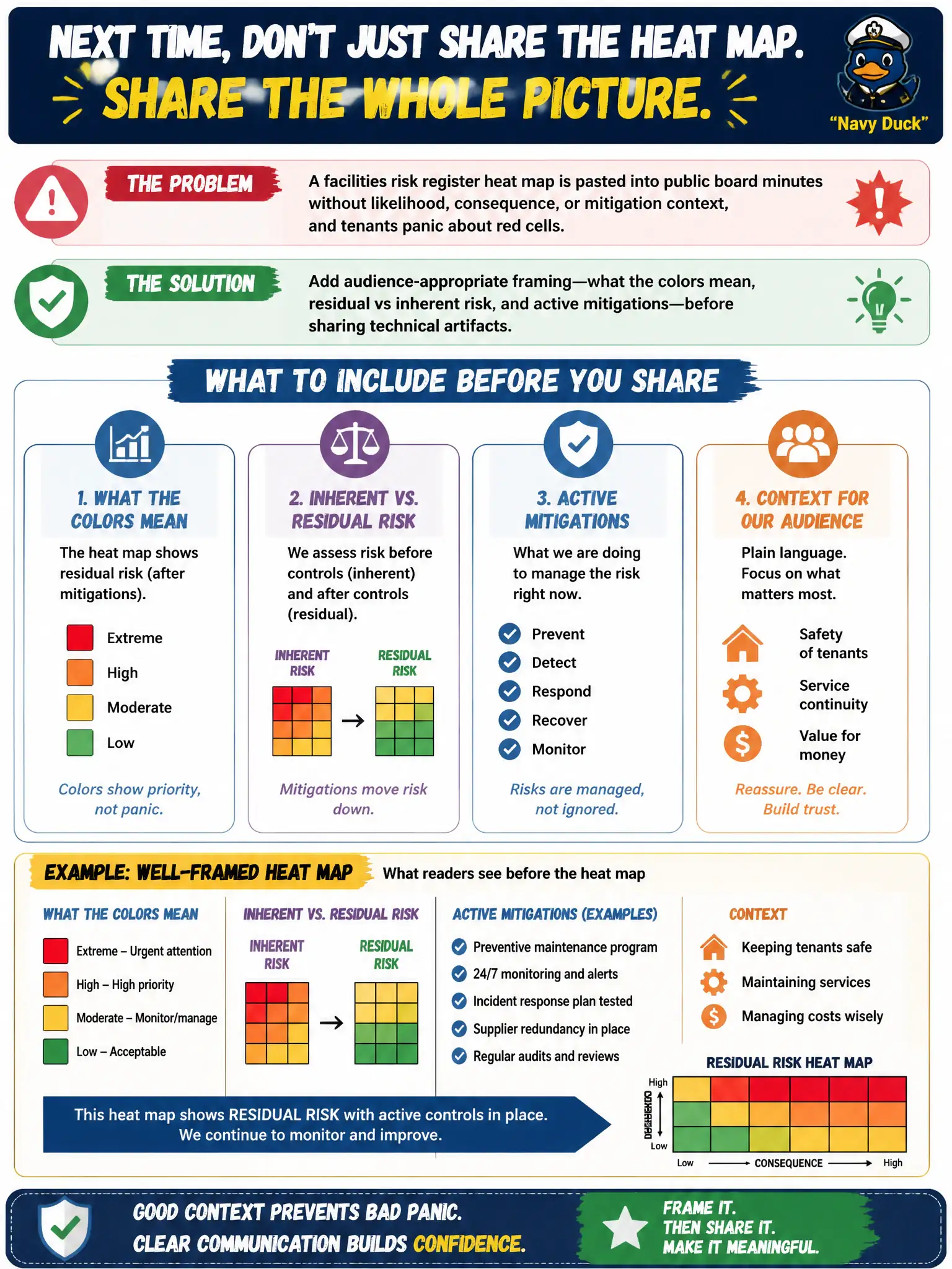
A facilities risk register heat map is pasted into public board minutes without likelihood, consequence, or mitigation context, and tenants panic about red cells. What should the risk communicator do next time?
Select an answer to reveal the explanation.
Short Explanation
A naked heat map is like dropping a weather radar screenshot on social media with no legend—red blobs look like disaster even when crews already have sandbags out. Audiences need the story around the picture: what the colors mean and what’s already being fixed. Context turns panic into informed calm.
Full Explanation
Audience-appropriate framing is the correct communication control because heat maps are specialist encodings of likelihood, consequence, and residual status. Civic boards, tenants, and the public routinely misread bare color cells as imminent catastrophe unless the communicator defines the scale, separates inherent from residual risk, and names mitigations already underway. Pairing the visual with that narrative converts technical artifacts into decision support and preserves trust in municipal facilities reporting.
Publishing raw heat maps only to external media so the public can rate risks themselves fails by concept because crowdsourcing interpretation of residual scores without legend or context amplifies panic rather than improving risk literacy; media amplification without framing worsens misunderstanding. Hiding every residual-risk score from governance forever to prevent overreaction fails because governance audiences require residual visibility to oversee treatment decisions—opacity is not a substitute for clear explanation. Replacing all visual risk artifacts with vague slogans that avoid numbers entirely fails because slogans strip the comparative and trend information boards need to prioritize scarce civic resources.
Exam caveat: MSI CRMC communication strategy emphasizes matching message form to audience capability; it does not forbid technical visuals, nor does it treat public silence or slogan-only messaging as adequate when material residual risk is discussed in civic forums.
Operational check: Before the next county facilities board packet or tenant notice, attach a one-page legend (color meanings, inherent vs residual, top mitigations in flight) and have a risk communicator review the packet for audience fit—then confirm recipients can state what red means and what is already being fixed.