
An executive asks why analytic recommendations keep failing even though dashboards look polished. What integrated view should the information manager emphasize?
Select an answer to reveal the explanation.
Short Explanation
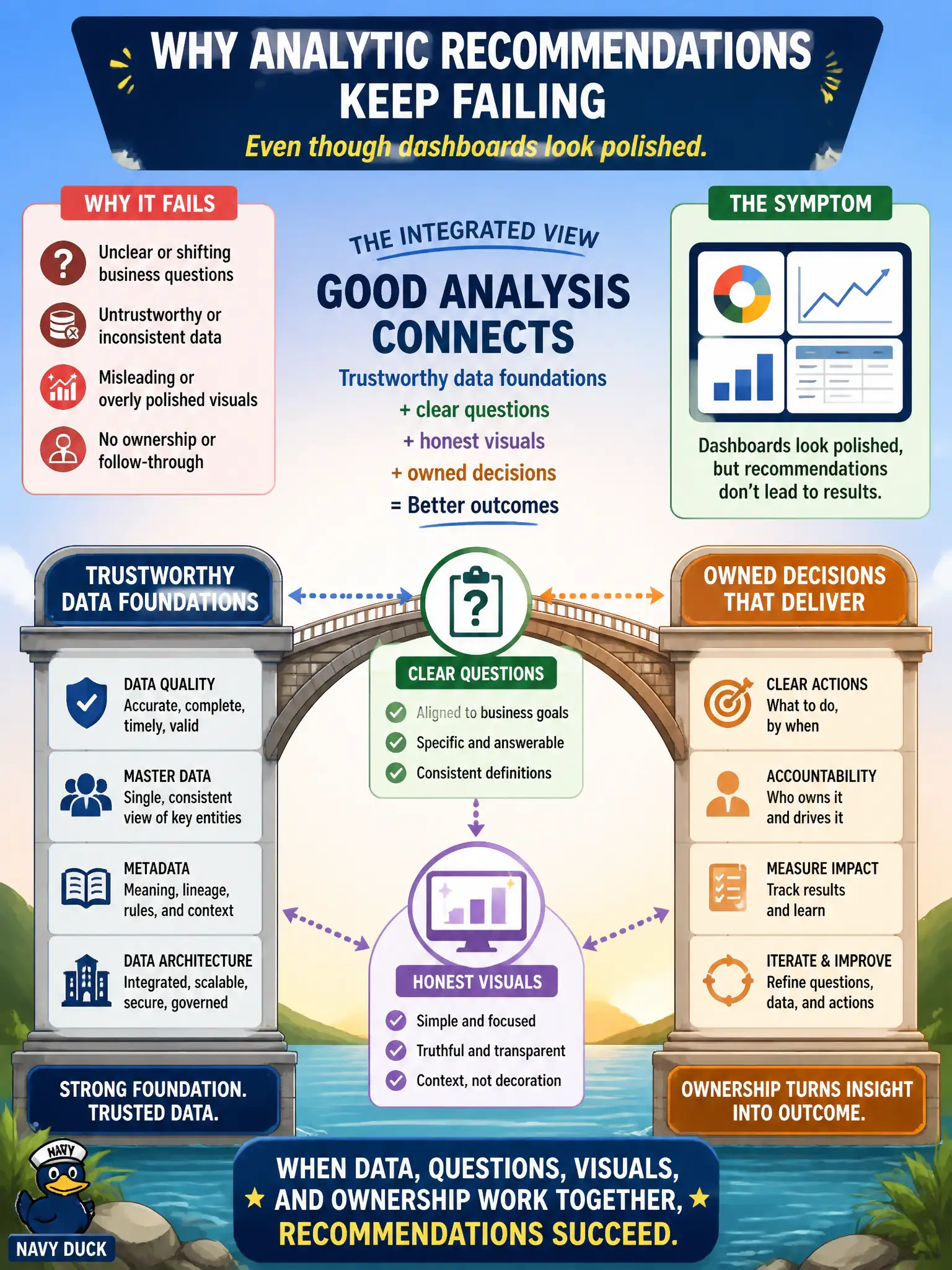
Pretty dashboards on shaky data are like a GPS bolted to a car with no wheels—you get a lovely route and go nowhere. Analysis that works sits on quality, master data, metadata, and sound architecture, then asks clear questions, shows honest visuals, and lands with owners who decide. Foundations first, fireworks second.
Full Explanation
When analytic recommendations keep failing despite polished dashboards, the information manager should emphasize an integrated view: good analysis connects trustworthy data foundations—quality, master data, metadata, and architecture—to clear questions, honest visuals, and owned decisions. Aesthetics alone cannot rescue conflicting definitions, broken lineage, or orphaned insights. Investing only in visual design while foundations rot produces beautiful wrong answers. Claiming analysis can ignore upstream data management if chart titles are clear enough denies how errors propagate into civic decisions. Treating owned decisions as unnecessary when visualizations are colorful and frequent leaves insights without action paths. Exam caveat: design quality still matters for comprehension; the exam point is that polish is insufficient without foundations, framing, honesty, and ownership working together across the information-management lifecycle. Operational check: audit a failed recommendation for foundation defects, unclear questions, misleading visuals, and missing owners; remediate the weakest link first; and require each executive analytic product to show certified sources, a decision owner, and an action status—not only visual polish.