
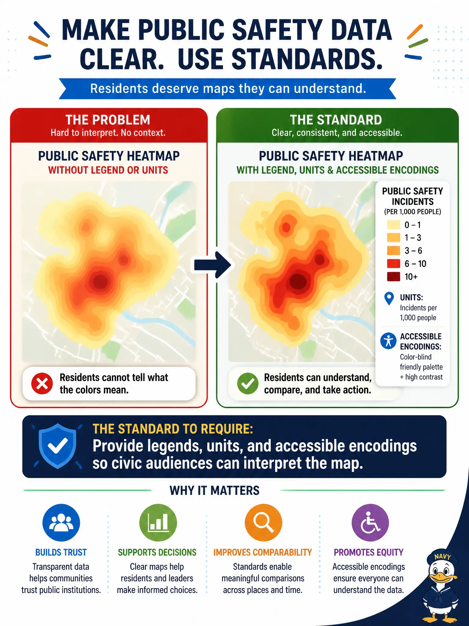
A public safety heatmap on the open data portal uses color intensity with no legend or units, and residents cannot tell what the colors mean. What visualization standard should be required?
Select an answer to reveal the explanation.
Short Explanation
A heatmap without a legend is like a traffic light with the colors scrambled—people see urgency but don't know what it means. Add units, a clear legend, and encodings that still work when color alone fails. Public audiences deserve maps they can actually read.
Full Explanation
Public safety heatmaps on open data portals must provide legends, units, and accessible encodings so civic audiences can interpret color intensity without guessing. Transparency fails when residents cannot tell whether colors mean counts, rates, or indices, or what scale applies. Using more colors without labels to look richer on social media prioritizes engagement aesthetics over comprehension and can alarm or reassure without basis. Removing the map entirely whenever color is involved abandons a useful spatial medium instead of fixing legend and accessibility standards. Publishing only an unlabelled numeric matrix to avoid visual bias withholds geographic intuition many residents need and still can confuse without metadata. Exam caveat: accessible encodings also include colorblind-safe palettes and alternatives to color-only meaning; legends are necessary but not always sufficient alone. Operational check: require legend, units, method note, and accessible palette on every public heatmap; user-test with non-analyst residents; and block portal publish until those elements pass review. In municipal information-management practice, record the rationale so future staff know which failure modes the rejected options would create for city services, and re-validate after the next cycle that the same control still holds.