
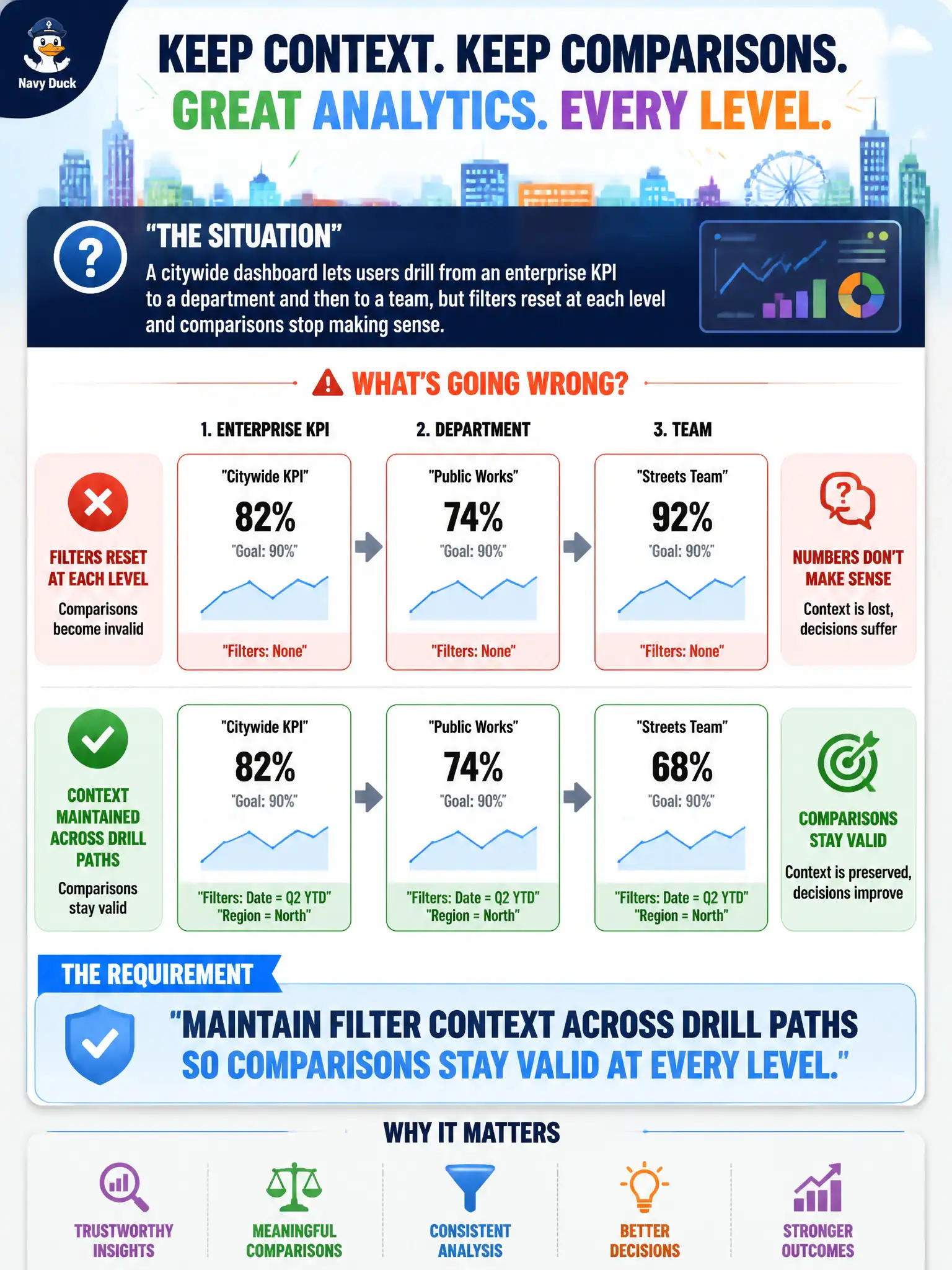
A citywide dashboard lets users drill from an enterprise KPI to a department and then to a team, but filters reset at each level and comparisons stop making sense. What analytic UX requirement should be enforced?
Select an answer to reveal the explanation.
Short Explanation
Drilling without keeping filters is like zooming a map and suddenly jumping to a different country—you lose the neighborhood you were studying. Keep the same time window, geography, and other filters as you go city → department → team. Otherwise the 'detail' isn't detail of the same question.
Full Explanation
When users drill from an enterprise KPI to department and team views, analytic UX should maintain filter context across drill paths so comparisons stay valid at every level. Lost filters produce mismatched denominators, silent scope changes, and false conclusions about which teams drive the enterprise number—especially dangerous in civic performance meetings. Disabling all drills so users only see the citywide tile avoids the bug by removing necessary investigation paths supervisors need. Randomizing filters on each drill makes exploration chaotic and destroys comparability on purpose. Exporting each level to a separate PDF so filter context never travels recreates the same discontinuity offline and multiplies conflicting printouts. Exam caveat: some drills intentionally change grain or scope and must relabel that change clearly in the UI; the failure mode under test is silent filter reset without user awareness. Operational check: test multi-level drill paths with sticky filters, show active filter chips at every level, warn on intentional scope changes, add automated UI checks where possible, and reject release of dashboards that drop context between enterprise and team views. In municipal practice, keep the rationale and rejected alternatives visible to on-call analysts and stewards so the next briefing cycle does not reintroduce the same failure mode for city services.