
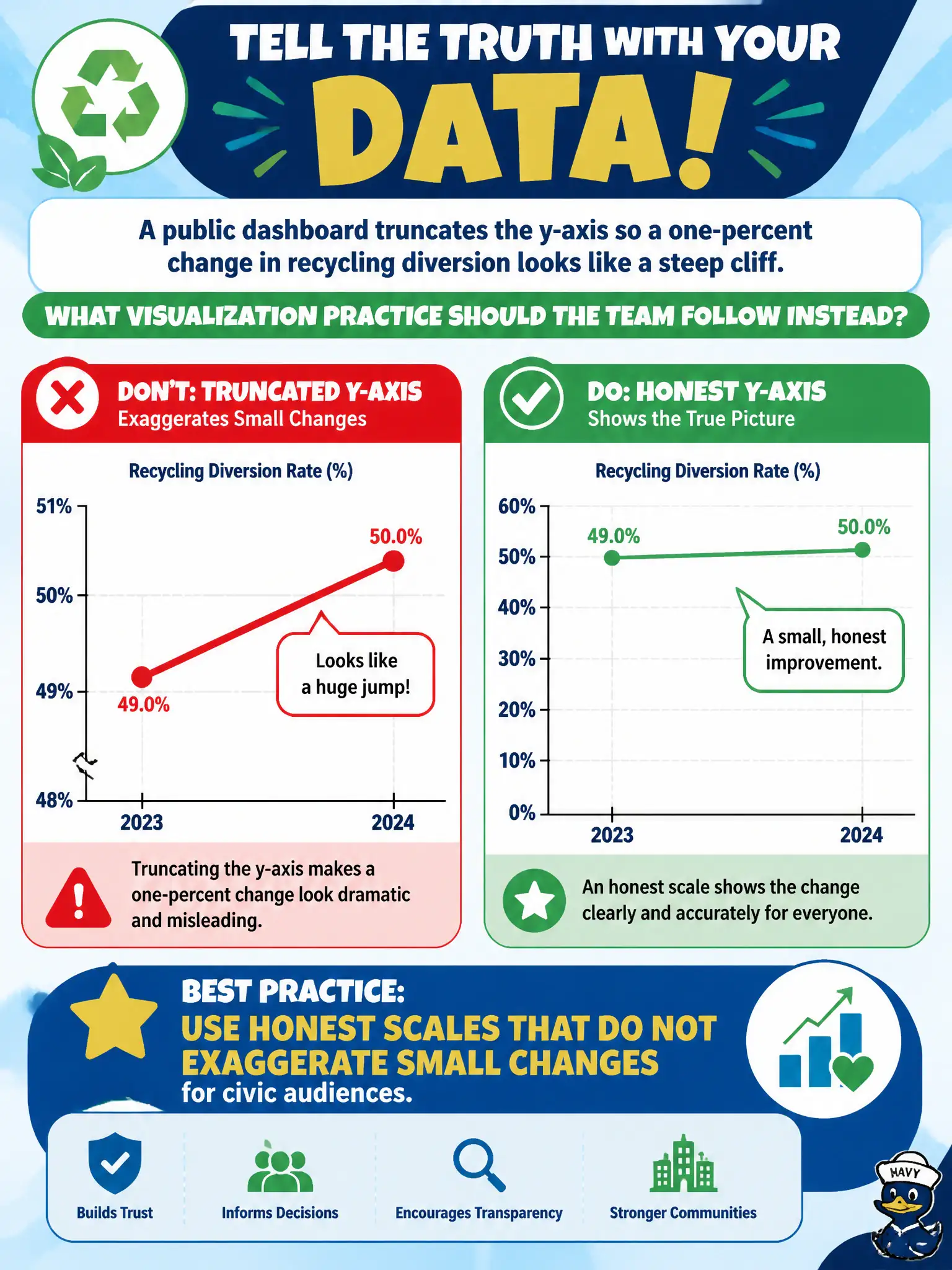
A public dashboard truncates the y-axis so a one-percent change in recycling diversion looks like a steep cliff. What visualization practice should the team follow instead?
Select an answer to reveal the explanation.
Short Explanation
Chopping the y-axis is like zooming a photo until a curb looks like a mountain. Civic audiences deserve honest scales that keep small changes looking small. Drama in the chart is not the same as insight.
Full Explanation
Public dashboards should use honest scales that do not exaggerate small changes for civic audiences who rely on charts for recycling, budget, and service decisions. Truncating the y-axis so a one-percent recycling diversion change looks like a steep cliff systematically overstates magnitude and undermines trust when residents or council discover the distortion. Always starting axes at the series minimum so tiny moves fill the frame fails as a common exaggeration pattern that confuses noise with transformation. Removing axis labels so viewers focus on color and icons fails by withholding the quantitative context needed for fair interpretation. Animating until the slope appears larger than the underlying data fails by prioritizing persuasion theater over proportional truth. Exam caveat: non-zero baselines can be appropriate for some interval measures when clearly labeled and not used to inflate change; the exam focus is avoiding deceptive exaggeration for public audiences. Operational check: review the diversion chart with a zero or otherwise justified baseline, retain clear axis labels and units, compare perceived versus actual change with a colleague, and publish a visualization standard forbidding unlabeled truncated axes on citizen-facing dashboards.