
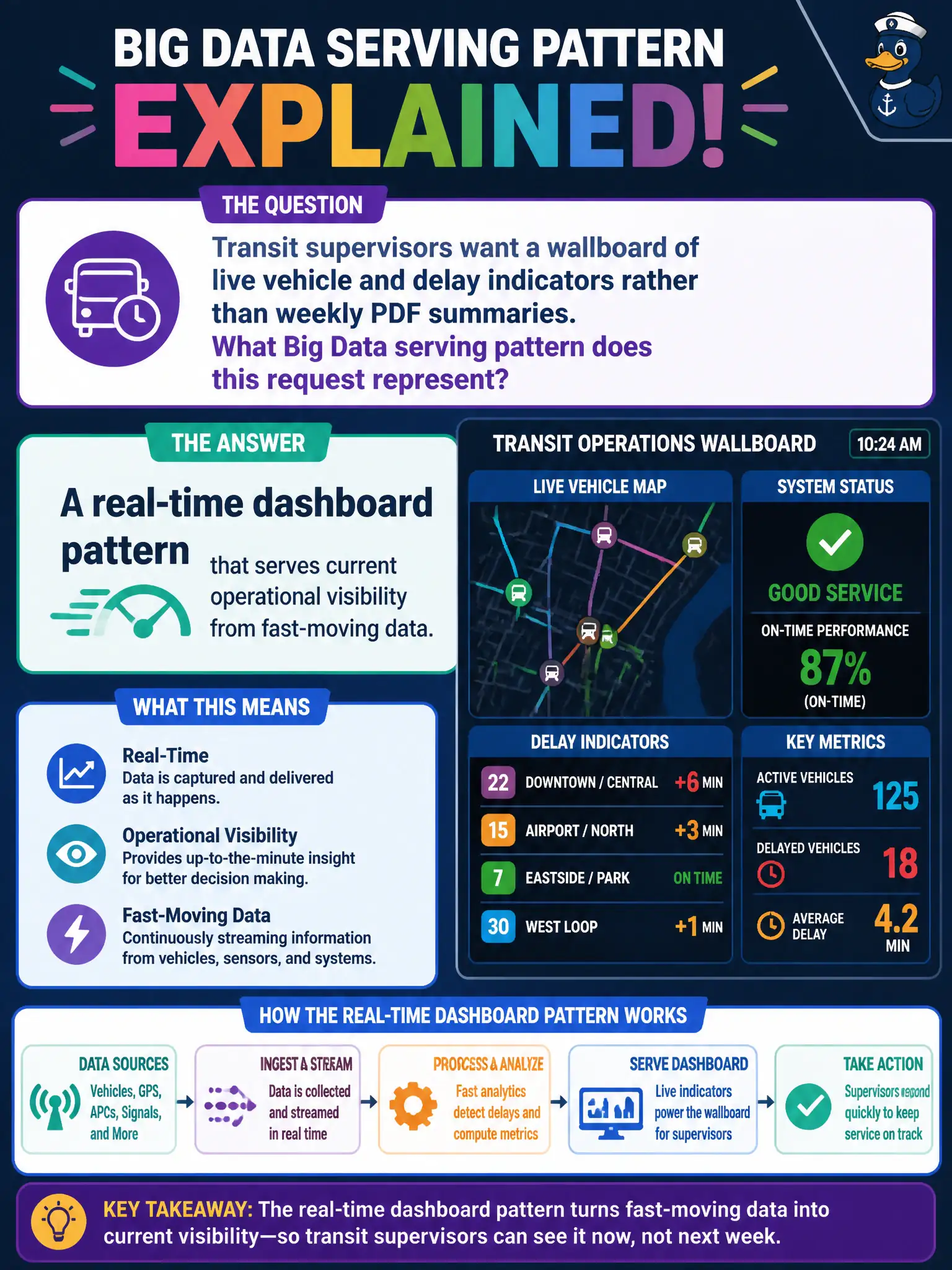
Transit supervisors want a wallboard of live vehicle and delay indicators rather than weekly PDF summaries. What Big Data serving pattern does this request represent?
Select an answer to reveal the explanation.
Short Explanation
Weekly PDFs are yesterday's newspaper; a live wallboard is the control-room window. Supervisors are asking for real-time serving—see the buses and delays while they still matter. That is a classic Big Data visibility pattern, not a binder exercise.
Full Explanation
Real-time dashboards are a Big Data serving and visibility pattern that present continuously updated indicators for operational decisions. Transit supervisors preferring live vehicle and delay wallboards over weekly PDFs are asking for that serving pattern so civic service issues are seen when they still matter. Latency between event and awareness shrinks when serving matches operational tempo.
Preferring once-yearly archival print that increases decision latency fails by concept: that is the opposite of live operational serving. Forbidding any visual indicators fails by concept: wallboards are legitimate serving. Limiting the pattern to static HR manuals fails by concept: real-time operational dashboards are not an HR-policy-only pattern.
Exam caveat: Recognize real-time dashboard serving as current operational visibility from fast-moving data—distinct from archival print or static policy documents.
Operational check: Instrument vehicle and delay feeds to the wallboard, verify refresh meets supervisor SLAs, and retire weekly PDF dependence for decisions that require live transit awareness. Document residual risk for civic operators and revisit after the next production change window.