
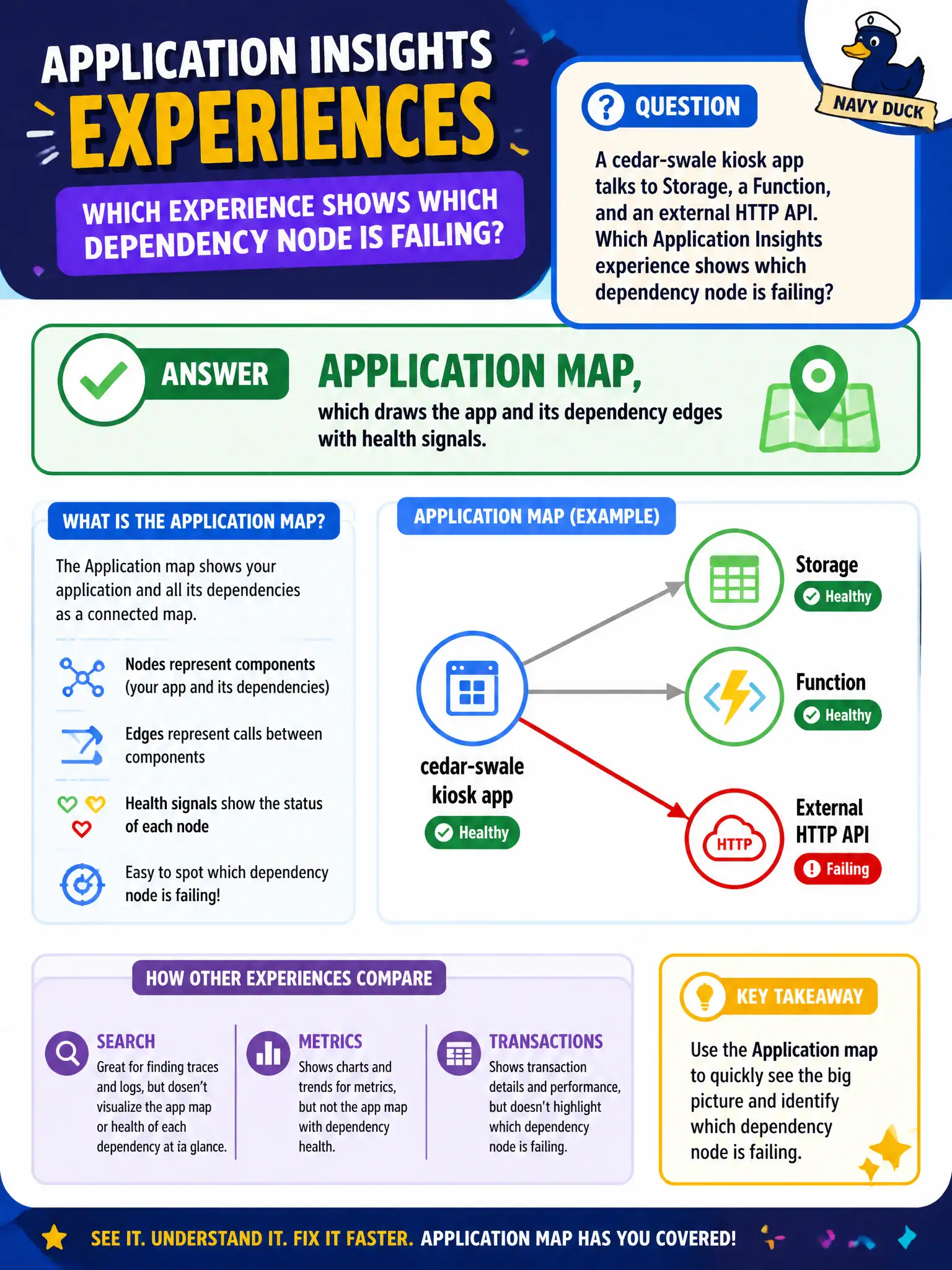
A cedar-swale kiosk app talks to Storage, a Function, and an external HTTP API. Which Application Insights experience shows which dependency node is failing?
Select an answer to reveal the explanation.
Short Explanation
Application map is the subway diagram of your app and its dependencies—red nodes show where pain lives. VM CPU tiles, AKS scale rules, and Redis hit ratios are different exams.
Full Explanation
Application map is the Application Insights topology view: it draws the instrumented cedar-swale kiosk app and its dependency edges (Storage, Function, external HTTP API) with health and performance signals on nodes and links. When a dependency node is failing or slow, the map highlights where pain lives so the developer can drill into that edge instead of guessing across disconnected charts.
An AZ-104 VM CPU chart for the guest OS fails because guest CPU utilization is a platform metric for virtual machines, not the application dependency graph. High CPU may be a symptom, but it does not show which Storage, Function, or HTTP dependency node is unhealthy in Insights.
AKS cluster node-pool scale rules fail because they are Kubernetes capacity controls. Scaling node pools does not visualize Application Insights dependency health for an App Service–style kiosk topology and is outside this Domain 4 map skill.
Azure Cache for Redis hit-ratio tiles fail as a topology view because hit ratio measures cache effectiveness, not the full application-plus-dependency map with failure coloring that Application map provides.
Exam caveat: the map only reflects instrumented components and sampled telemetry—uninstrumented backends or aggressive sampling can hide or thin edges. Operational check: generate traffic that hits Storage, the Function, and the external API, refresh Application map, and confirm each dependency edge appears with sensible call rates before using it during an incident.