
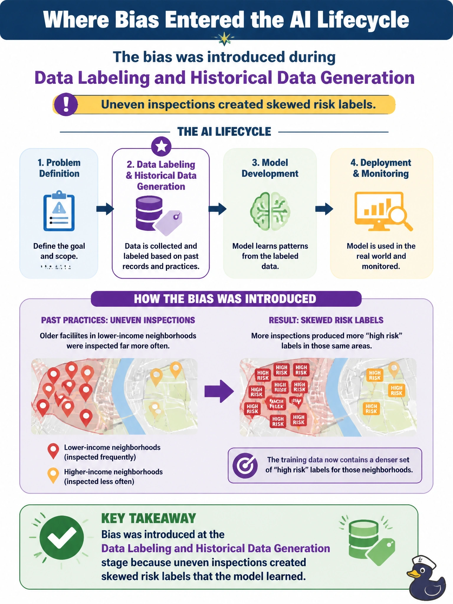
A utility's AI system flags equipment as high risk for maintenance. It was trained on years of historical inspection records in which older facilities in lower-income neighborhoods had been inspected far more often due to past staffing patterns, producing a denser set of "high risk" labels for those areas. The system now consistently over-flags equipment in those same neighborhoods. Which stage of the AI lifecycle introduced this bias?
Select an answer to reveal the explanation.
Short Explanation
If inspectors visited one neighborhood five times as often as another, of course that neighborhood ends up with more 'high risk' findings on paper — the label just reflects who got looked at, not who's actually riskier. You're seeing bias that got baked in at the data labeling stage, when uneven past inspections generated a skewed set of records for the model to learn from.
Full Explanation
Data labeling and historical data generation is correct because the bias traces directly to how the historical labels were generated: unequal past inspection frequency created an unequal number of "high risk" records for certain neighborhoods, and the system learned that imbalance as if it reflected true risk. Blaming the phased rollout is a plausible-sounding distractor, but a phased regional deployment describes how the system was introduced, not why its outputs are skewed; the skew exists regardless of rollout order. Blaming the ranked-list interface misattributes the cause to how results are displayed; a ranked list changes how crews see the output, not why certain neighborhoods are over-flagged in the first place. Blaming vendor headquarters location is an unrelated factor; where a vendor happens to be based has no bearing on which historical inspection records were used to train the system. The general principle: bias introduced through how past outcomes were recorded and labeled can persist even when the deployment process itself is neutral, which is why the labeling and data-generation stage deserves scrutiny of its own.