
In a classification task, what information does a confusion matrix primarily present?
Select an answer to reveal the explanation.
Short Explanation and Infographic
Pay close attention here—this one is pure vocabulary. A confusion matrix is the scoreboard of "what it predicted" versus "what it really was." True positives, false positives, the whole grid. It's not a feature histogram, not a correlation heatmap, and not your loss-over-time chart. Boss walks in asking why precision tanked on the fraud class? You open the confusion matrix and see the false negatives. Exam trap: anything that sounds "matrix-y" about data exploration. If it's about classifier hits and misses by class, you've got it. Land it: actual vs predicted counts. That's the matrix.
Full explanation below image
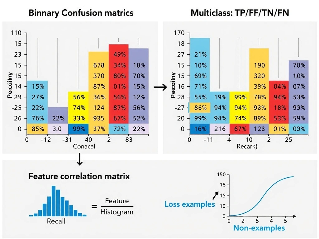
Full Explanation
A confusion matrix is a contingency table for categorical predictions. Rows typically represent true classes and columns predicted classes, or vice versa by convention. Each cell counts how many examples fell into that true-versus-predicted pairing. For binary problems the familiar cells are true positives, false positives, true negatives, and false negatives; for multiclass problems the same idea expands to a full grid with one row and column per class. From these counts one derives accuracy, precision, recall, F1, specificity, and class-wise error rates. Without the matrix, a single scalar metric can hide which classes are confused with which.
The matrix is indispensable when class imbalance or asymmetric costs matter. Overall accuracy can look high while a minority class is almost never recovered; the confusion matrix exposes that failure mode immediately by showing empty or near-empty true-positive cells for rare labels. Threshold selection for probabilistic classifiers can be guided by how movements trade false positives against false negatives, which appear directly in the table. In operations, different error types have different costs—missing fraud is not the same as extra manual review—so the breakdown is actionable.
Distractors point to different tools. Feature distribution analysis supports exploratory data analysis and data quality checks. Correlation matrices diagnose multicollinearity or redundant inputs among predictors. Loss curves diagnose optimization progress and underfitting or overfitting dynamics during training. None of those substitute for comparing predicted labels to ground truth in a structured grid after a model has produced class decisions.
Best practice is to report the confusion matrix alongside business-relevant metrics, inspect off-diagonal cells for systematic confusions such as class A often predicted as B, and slice by segment when deployment populations differ from the evaluation set. Normalization by row or column can aid interpretation when class sizes differ widely, but the raw counts remain the foundation. On exams, define the confusion matrix as showing correct and incorrect predictions relative to actual outcomes, structured by class—not data distributions, feature correlations, or loss trajectories over epochs.