
How does AppDynamics show where a Cisco-API-consuming app spends time across components?
Select an answer to reveal the explanation.
Short Explanation
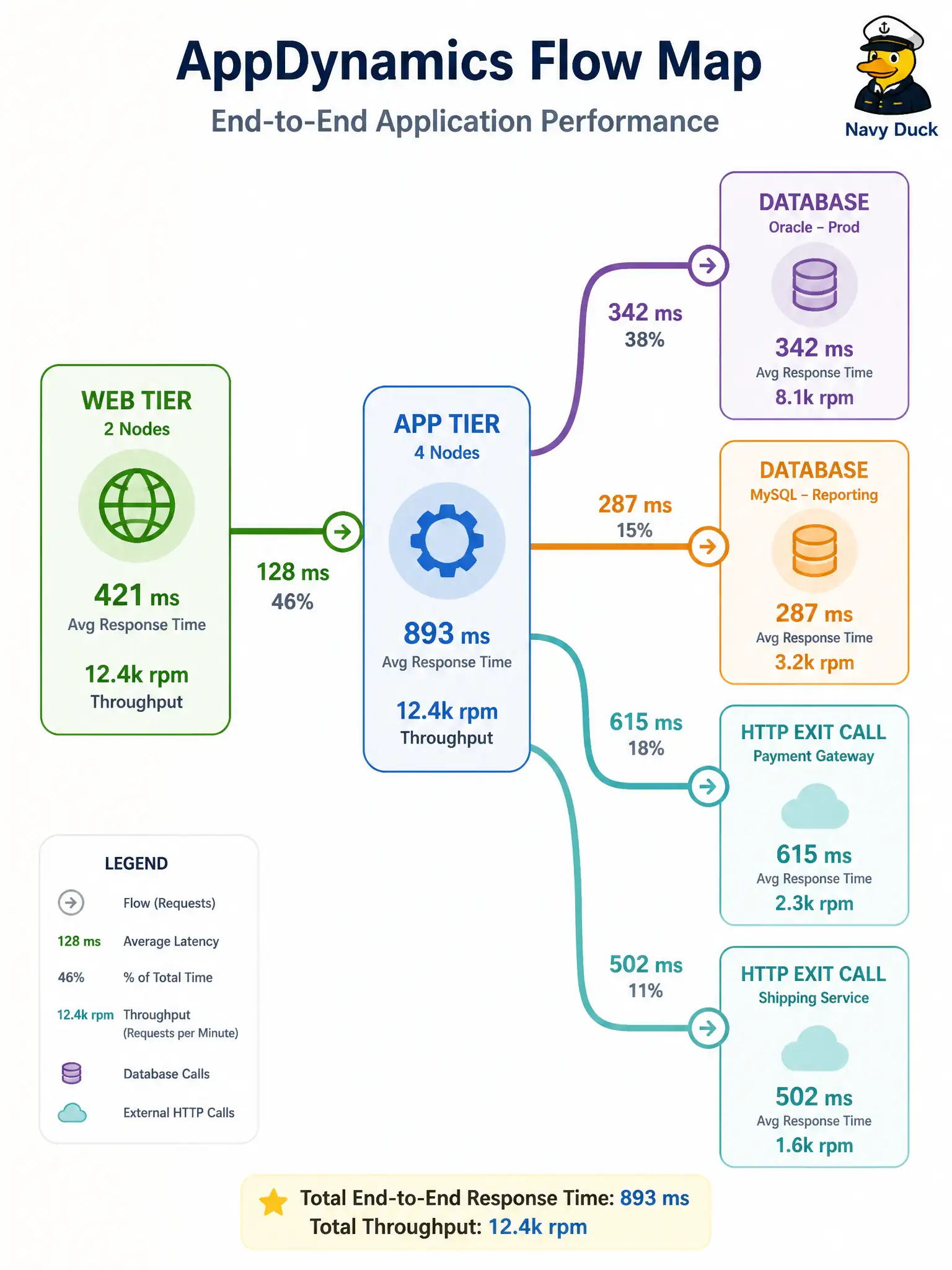
The flow map is the subway diagram of your app—origin tier, downstream stops, and exit calls to databases or HTTP—so you see where time rides.
Full Explanation
AppDynamics shows where a Cisco-API-consuming app spends time by stitching a flow map of the originating tier, downstream tiers, and exit calls (databases, HTTP, and other backends). That map is the application topology view for performance work: you see how a civic service that calls Cisco APIs relates to its dependencies and where latency accumulates.
Replacing DNA Center wireless health retrieve with AppDynamics dashboards fails by confusing assurance API tasks with APM flow mapping. Treating Intersight PhysicalSummaries GET as the application flow map fails because compute inventory is not an application tier/exit call graph. Listing only OS process IDs with no tier or exit-call relationships fails to show cross-component time distribution the flow map provides.
Exam caveat: incomplete agent coverage produces partial flow maps—missing an agent on a downstream tier looks like a mysterious exit rather than a fully modeled hop, so instrument every tier that participates in the municipal transaction path.
Operational check: open the flow map for the application that calls Cisco APIs, verify originating tier, downstream tiers, and exit calls match the architecture diagram, and investigate any unexpected external call before promoting the release.