
PROC ASSESS is run with the FITPLOT option on a logistic regression model. What does the FITPLOT calibration plot display?
Select an answer to reveal the explanation.
Short Explanation
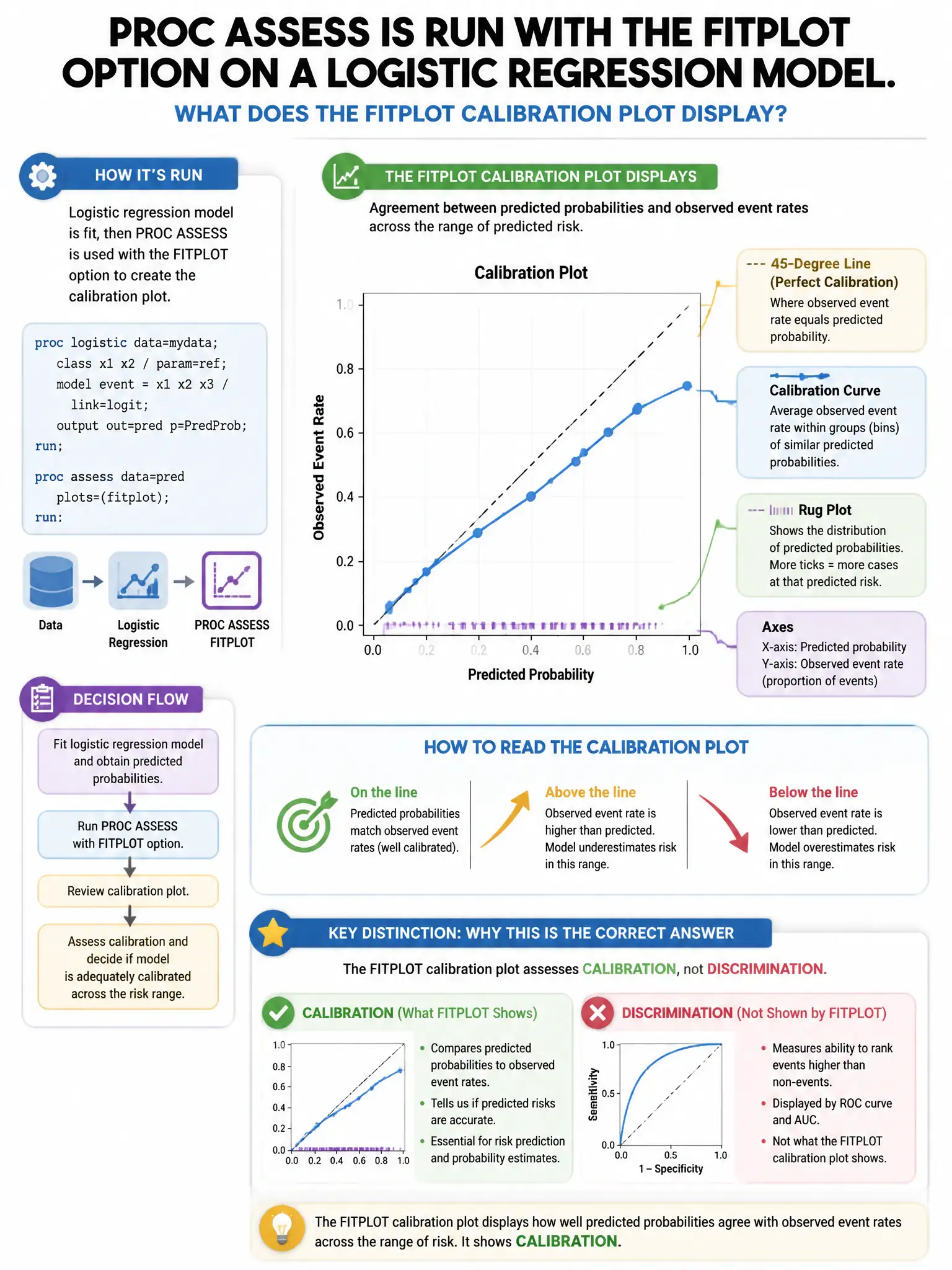
Here's the deal — the calibration plot showing observed event rates against binned predicted probabilities, with a 45-degree reference line, is what PROC ASSESS's FITPLOT option produces. You're checking whether predicted probabilities match observed outcomes, not drawing ROC, residual, or gain charts.
Full Explanation
PROC ASSESS's FITPLOT option produces a calibration plot where predictions are grouped into bins, and the observed event rate in each bin is plotted against the mean predicted probability. Points from a well-calibrated model align with the 45-degree line, where predicted probability equals observed event rate. The ROC curve with area-under-the-curve annotation for both training and validation datasets would be a separate assessment. The scatter plot of residuals versus fitted values to assess heteroscedasticity is for continuous outcomes, not logistic regression. The gain chart showing cumulative target capture rate at each decile of predicted probability is a separate display associated with other assessment plots or options, not the FITPLOT calibration plot alone.