
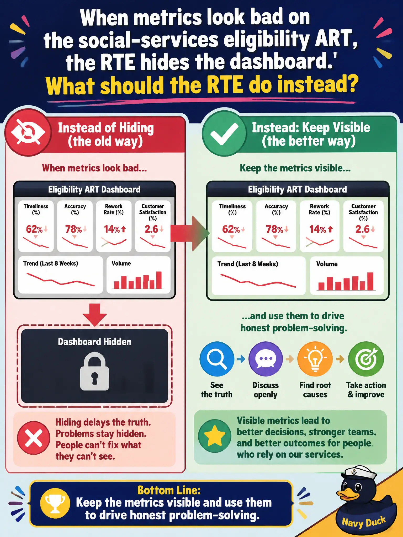
When metrics look bad on the social-services eligibility ART, the RTE hides the dashboard. What should the RTE do instead?
Select an answer to reveal the explanation.
Short Explanation
Bad eligibility numbers are embarrassing and also the only useful ones. Hiding the dashboard is like unplugging the check-engine light. Effective RTEs leave reality on the wall so the ART can fix the system, not the screenshot.
Full Explanation
When metrics look bad, effective RTE behavior keeps them visible and uses them to drive honest problem-solving. Hiding the dashboard on a social-services eligibility ART protects egos while blocking Relentless Improvement for residents waiting on eligibility decisions. Transparency under pressure is a Core Value in action and keeps teams aligned on real queues, defects, and cycle time. Showing the dashboard only after a PI in which every metric is green guarantees that learning arrives too late and trains the organization to manage appearances instead of outcomes. Replacing flow metrics with a narrative that the ART is "on a journey" without numbers removes the signal needed to fix blockers and quality escapes in eligibility processing. Sharing real numbers only with a small executive circle while keeping teams in the dark prevents the people closest to the work from improving the system that serves clients. Exam caveat: Context and coaching tone matter—metrics should drive inquiry and experiments, not public humiliation—but visibility itself is not optional for an effective RTE. Operational check: Review the eligibility ART's flow and quality metrics in ART Sync with teams present, pick the worst signal, and assign a timeboxed improvement experiment rather than blanking the dashboard.