
A data science team is preparing an executive report comparing a new model's classification accuracy across ten distinct product categories. The stakeholders need to see both the average accuracy for each category and the statistical uncertainty or variance in the experimental results. Which visualization method is most appropriate?
Select an answer to reveal the explanation.
Short Explanation
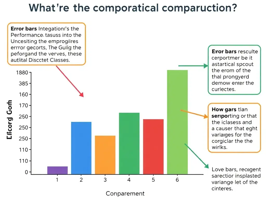
Here's the deal: when you're presenting data to stakeholders, you need to make it super clear and technically honest. The bar chart displaying average accuracy with error bars lets you compare categories side by side while showing variance or margin of error. Flat averages alone can hide inconsistent results.
Full Explanation
In data visualization and scientific reporting, selecting the appropriate chart type is critical for conveying both the central tendency (such as the mean) and the dispersion (such as variance or standard deviation) of experimental data. When comparing a metric—such as model accuracy—across distinct nominal or ordinal categories, the bar chart displaying average accuracy with error bars representing variance for each category is the standard and most readable format. However, simply presenting the mean value can be misleading if the underlying data has high variability. To address this, including error bars (which represent standard deviation, standard error, or confidence intervals) provides a visual depiction of the uncertainty or variance associated with each category. This allows stakeholders to evaluate not only which categories perform best on average but also the reliability and consistency of those measurements. The pie chart showing the percentage distribution of samples across the ten categories is incorrect because pie charts are designed to show part-to-whole relationships or proportions of a single variable. They are poor tools for comparing performance metrics across multiple categories and cannot represent statistical variance. The multi-series line chart tracking accuracy fluctuations across consecutive runs is incorrect because line charts are used to show continuous trends, typically over time or another ordered variable. The task is to compare average accuracy across ten distinct product categories, not to emphasize a sequential trend, and using a line chart for discrete categories implies a sequential relationship that does not exist. The scatter plot graphing category indexes against individual sample prediction times is incorrect because scatter plots are ideal for showing correlations between two continuous variables across individual data points but do not summarize categorical aggregates or show clear comparative performance metrics with error ranges.