During a large-scale hyperparameter optimization sweep for a transformer model, you generate hundreds of trials, each testing combinations of learning rate, batch size, dropout rate, and optimizer types, resulting in varying loss and accuracy metrics. To identify multi-dimensional patterns and understand how these hyperparameters interact to affect model performance, which visualization method should you use?
Select an answer to reveal the explanation.
Short Explanation and Infographic
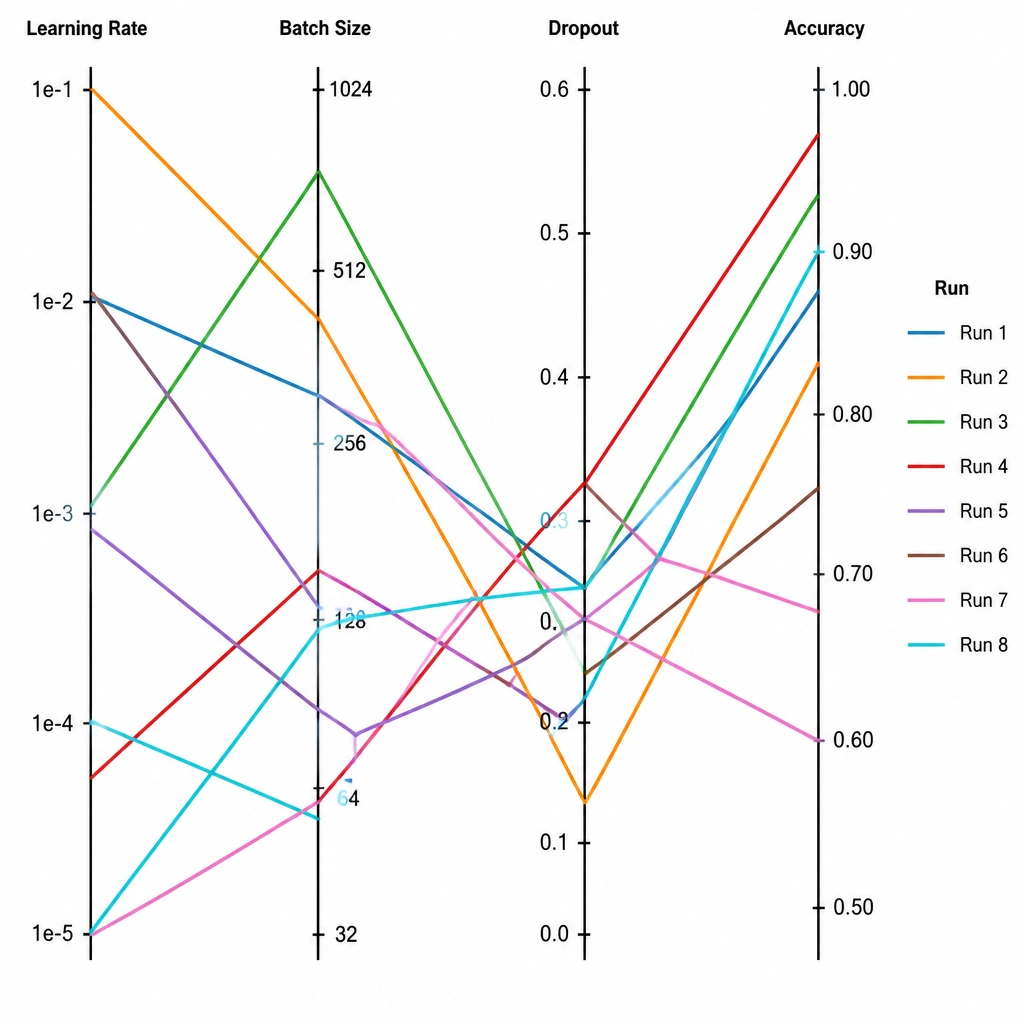
Think of it like this: you've just run hundreds of training trials, adjusting the learning rate, batch size, and dropout rate, and you're staring at a mountain of data. If you use a simple scatter plot or line chart, you can only see two variables at a time — not very helpful when you have five variables interacting! This is where a parallel coordinates plot saves the day. It lays out all your parameters and performance metrics as vertical lines side-by-side. Then, each trial is drawn as a single line passing through all these axes. You can instantly see paths that lead to high accuracy, or paths that lead to terrible validation loss. Pay close attention here, because hyperparameter tuning is a multi-dimensional puzzle, and this plot is the best tool to solve it!
Full explanation below image
Full Explanation
Hyperparameter tuning involves analyzing high-dimensional datasets where multiple input parameters (e.g., learning rate, batch size, weight decay) interact in complex ways to produce output performance metrics (e.g., accuracy, F1-score, validation loss). - A parallel coordinates plot is a visualization technique designed for plotting high-dimensional multivariate data. Each variable (hyperparameter or performance metric) is assigned its own vertical, parallel axis. A single trial is plotted as a continuous line intersecting each axis at its corresponding value. By highlighting or filtering lines that terminate at high-performance values, engineers can visually trace the combinations of hyperparameters that consistently produce optimal results. - A 3D pie chart is not useful for multi-dimensional relationship analysis and obscures details by only showing binary success/failure distributions. - A line chart of validation loss over chronological trials only shows progress over time or trial index but fails to correlate the performance with the underlying hyperparameter values that caused it. - A stacked bar chart of batch sizes only shows the distribution of a single hyperparameter across trials without linking it to the resulting performance.