
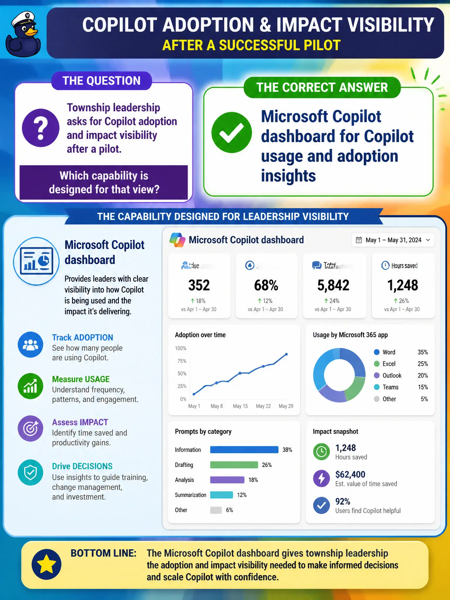
Township leadership asks for Copilot adoption and impact visibility after a pilot. Which capability is designed for that view?
Select an answer to reveal the explanation.
Short Explanation
After a Copilot pilot, leaders want a scoreboard—not a mailbox trace dump. The Microsoft Copilot dashboard is built to show Copilot adoption and impact style insights. Planner and Intune exports answer other questions.
Full Explanation
The Microsoft Copilot dashboard is designed to give township or city leadership visibility into Copilot usage and adoption after a pilot, which is different from raw mailbox traces or generic project boards. At fundamentals depth, that dashboard is the purpose-built program view for Copilot readiness, usage, and related benefit signals so digital workplace leads can brief executives without assembling ad-hoc spreadsheets from unrelated admin tools. Municipal pilots especially need that focused scoreboard because councils ask whether the Copilot investment is landing with staff, not whether a single message was delivered.
Exchange message trace is a mail-flow diagnostic for individual messages; it is not a Copilot adoption metric and cannot stand alone as the city’s Copilot program report. Planner board burndown charts track task completion on Planner boards and do not measure Copilot usage across Microsoft 365. Intune compliance policy JSON exports describe device compliance configuration and have no Copilot adoption semantics.
An exam caveat is that the Copilot dashboard complements—rather than replaces—Microsoft 365 service health and broader Admin center usage reports. Service health still tells you whether Exchange or Teams is degraded; the Copilot dashboard tells you how the Copilot initiative is being adopted. Operationally, after the pilot cohort is licensed, open the Microsoft Copilot dashboard with an authorized admin identity, verify usage and adoption tiles reflect the municipal pilot group, and schedule a recurring export or review cadence for the steering committee.