
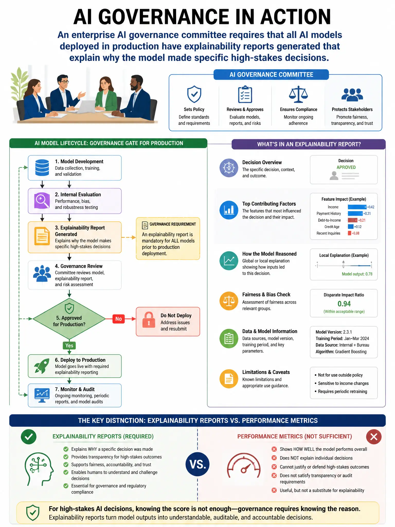
An enterprise AI governance committee requires that all AI models deployed in production have explainability reports generated that explain why the model made specific high-stakes decisions (e.g., loan denial, hiring rejection). Which Azure Machine Learning capability generates these explanations?
Select an answer to reveal the explanation.
Short Explanation
You need the Azure Machine Learning Responsible AI dashboard with its model explainability component because it uses SHAP or LIME to show which features drove a specific high-stakes prediction. That gives you audit-ready explanations for decisions like loan denials or hiring rejections.
Full Explanation
The Azure Machine Learning Responsible AI dashboard with its model explainability component is the capability that generates these explanations because it computes feature importance scores using techniques like SHAP (SHapley Additive exPlanations) and LIME (Local Interpretable Model-agnostic Explanations). These methods explain which input features had the greatest influence on specific predictions, enabling audit-ready explainability reports for high-stakes decisions. SHAP values specifically show the contribution of each feature to the model's output for individual predictions. The automated ML (AutoML) model comparison chart is wrong because it compares model performance metrics such as accuracy and area under the curve across different algorithm choices; it does not explain individual predictions. The Microsoft Purview Data Map lineage graph is wrong because it shows data flow from source to model, not why the model made a specific prediction. The Azure Monitor Application Insights model performance metrics option is wrong because it tracks interface-level metrics such as latency and error rates for the deployed model endpoint; it does not generate prediction-level explanations.