
A Copilot Studio agent guides employees through a five-step benefits enrollment process. The product team has configured custom events in Application Insights for each step: 'EnrollmentStarted', 'PlanSelected', 'DependentsAdded', 'ReviewCompleted', and 'EnrollmentSubmitted'. After one month of data, the product team wants to identify where most users abandon the process. Using Application Insights, which analysis method and KQL query approach would directly reveal the step-by-step drop-off rates between each enrollment stage?
Select an answer to reveal the explanation.
Short Explanation and Infographic
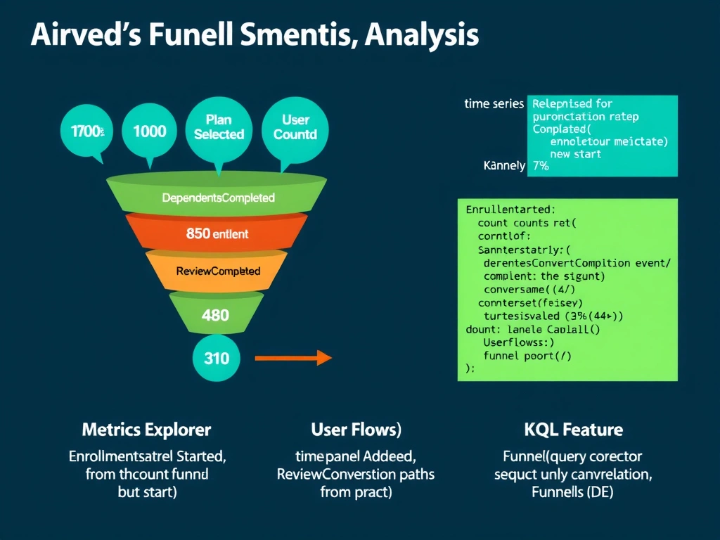
Funnel analysis requires knowing how many unique users made it through each gate. A KQL query that counts distinct sessions per event step and calculates the percentage that survived each transition gives you the drop-off rate at every step. The Funnels UI in Application Insights does this visually for you — but knowing the KQL approach proves you understand what the tool is actually computing under the hood.
Full explanation below image
Full Explanation
Funnel analysis in Application Insights identifies where users abandon a multi-step process by tracking the percentage of a starting cohort that completes each subsequent step. For the AB-620 exam, you need to understand both the KQL approach and the Application Insights Funnels feature.
Option D is correct because it describes both the analytical mechanism (KQL query for computing session-level counts and conversion rates) and the optional UI alternative (the Funnels feature). The correct KQL approach queries the customEvents table, groups by event name, counts distinct session_Id values (user sessions) for each event, and calculates the conversion rate between each consecutive step as (count_step_N / count_step_1) * 100. This produces a funnel table showing exactly which step has the greatest percentage drop-off. Example KQL:
`` customEvents | where name in ('EnrollmentStarted', 'PlanSelected', 'DependentsAdded', 'ReviewCompleted', 'EnrollmentSubmitted') | summarize Users = dcount(session_Id) by name | order by Users desc ``
The Funnels feature in Application Insights provides a GUI that performs this analysis without requiring KQL — but D correctly acknowledges both approaches.
Option A describes Metrics Explorer, which shows event counts as time-series data. This is useful for trend analysis (e.g., enrollment volume over time) but does not calculate conversion rates between steps. Comparing absolute counts across events does not account for users who started at different times or who may complete steps in a single session vs. across multiple sessions. Absolute counts do not equal funnel conversion rates.
Option B describes the User Flows visualization, which is designed for web and app page navigation analysis — it shows the paths users take through page views and events in a Sankey diagram. While User Flows can visualize event sequences, it is not designed for sequential funnel analysis with percentage drop-off calculation between ordered steps. The Funnels feature is the purpose-built tool for this.
Option C describes the Application Insights Funnels feature correctly but presents it as the complete answer without acknowledging the underlying KQL mechanism. While Funnels is a valid UI approach, option D is more complete because it demonstrates understanding of both the KQL computation and the Funnels feature as a visual alternative. On an exam, demonstrating the deeper analytical understanding is always preferred.
Exam tip: For Application Insights funnel analysis on AB-620, know these key KQL functions: dcount() for counting distinct sessions/users, summarize for aggregation, and order by for ordering results. Know that the Funnels feature requires events to be configured as ordered steps, and that it tracks users who complete all steps in sequence. The key metric is 'conversion rate between steps' (not absolute counts), and the goal is identifying the step with the highest drop-off percentage.