
Security leadership wants to see monthly trends in incident counts, mean time to respond and the top attack categories across the environment, without asking analysts to run searches each time. What should be built in Splunk?
Select an answer to reveal the explanation.
Short Explanation
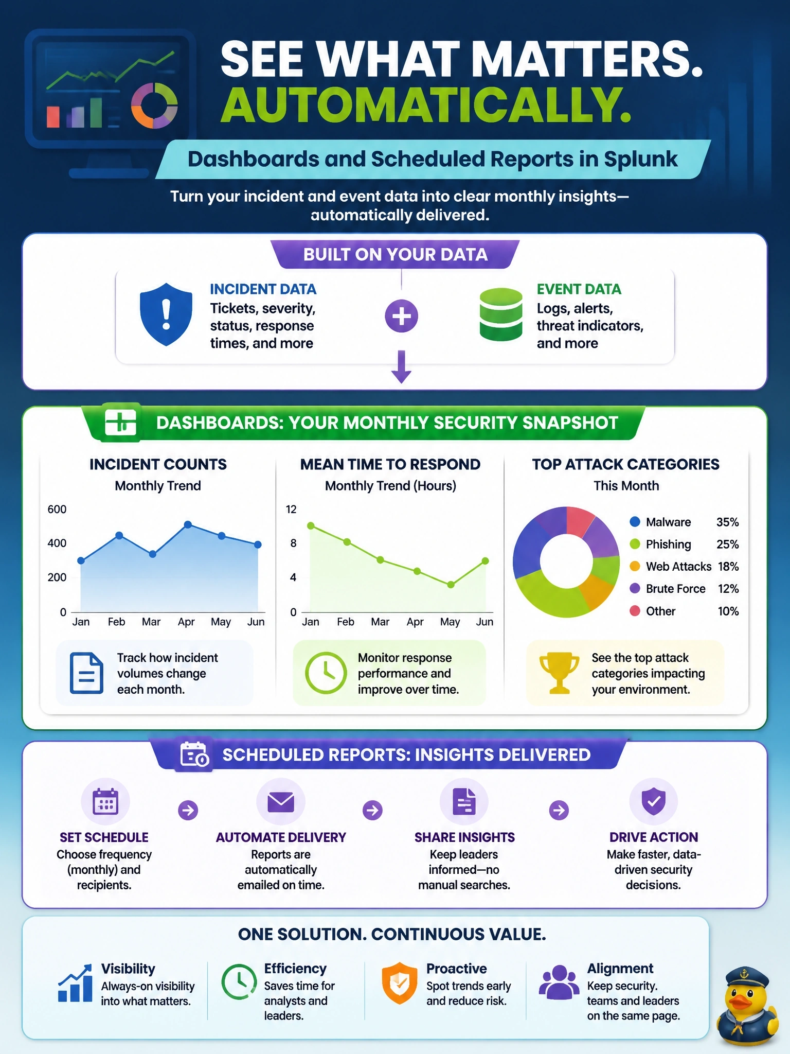
Leadership wants the scoreboard, not the play-by-play. Dashboards and scheduled reports pull the trends together and deliver them on a schedule, so you don't have to rerun searches by hand. A correlation search is the trap; that's for catching attacks, not charting them.
Full Explanation
Splunk dashboards visualize search results as charts, tables and single-value panels, and scheduled reports run saved searches on a timetable and can deliver results by email or PDF. Built on incident and event data, for example notable event status and timestamps in Enterprise Security or case data from Splunk SOAR, they can show monthly incident counts, mean time to detect and respond, and the top categories or techniques. Accelerated data models or summary indexing can keep these views fast over long time ranges. Enterprise Security also ships posture and audit dashboards that provide a starting point. A correlation search that creates a notable event for each closed incident would generate alerts about resolved work, adding noise to the analyst queue without producing trend views. A SOAR playbook that runs on every event is an automation tool for response actions; computing metrics this way is an indirect, fragile approach and still lacks a presentation layer for leadership. A separate index holding copies of incidents duplicates data and storage without providing visualization. Exam caveat: metrics are only as good as consistent status updates, so incident workflows must record when items are acknowledged and closed. Operational check: compare dashboard metrics for one month against a manual count of incidents and their closure times.