
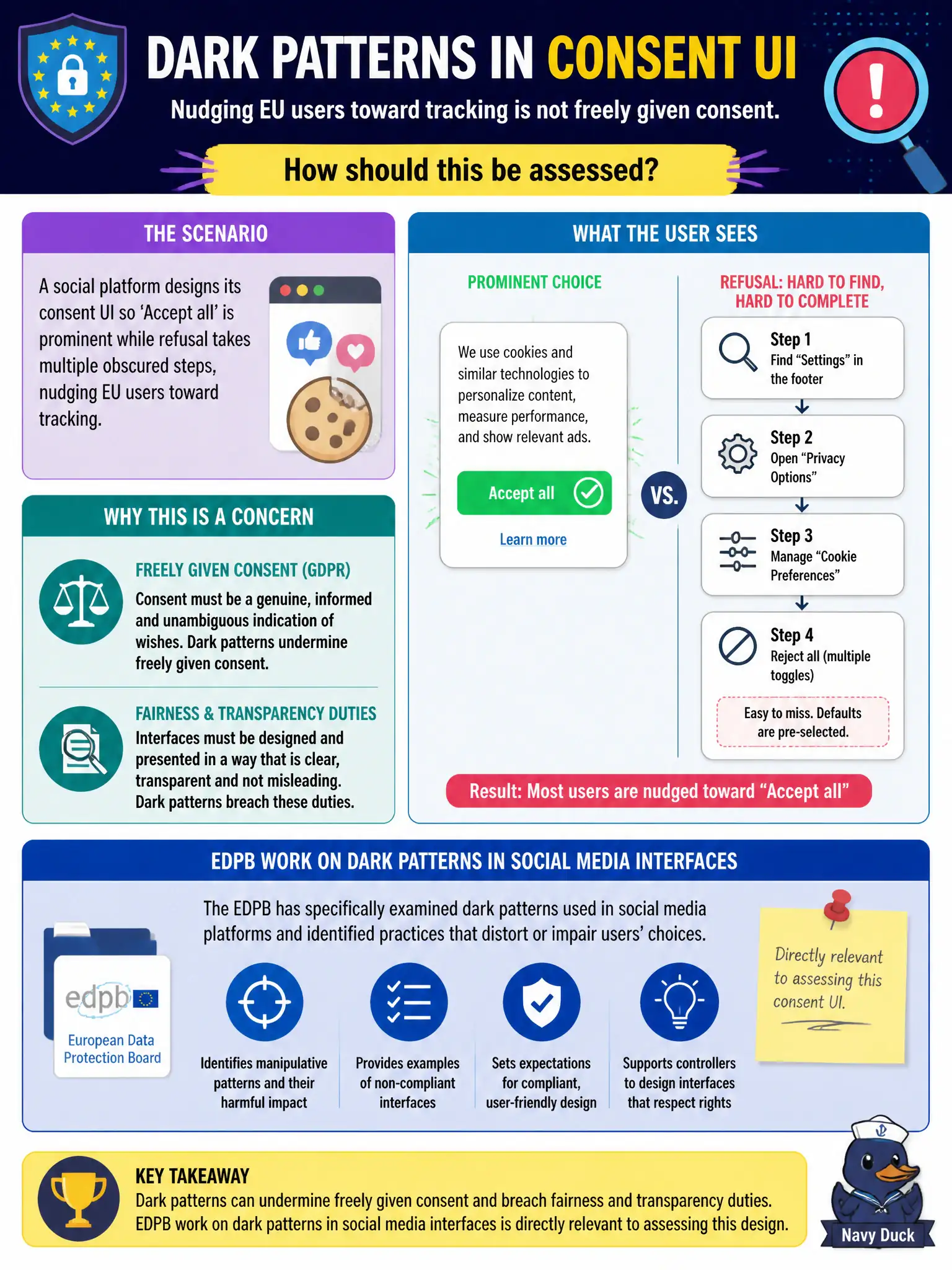
A social platform designs its consent UI so 'Accept all' is prominent while refusal takes multiple obscured steps, nudging EU users toward tracking. How should this be assessed?
Select an answer to reveal the explanation.
Short Explanation
When Accept is a giant green button and Refuse is a scavenger hunt, that is a dark pattern—not free choice. European DP thinking (and EDPB social-media interface work) calls that out. Fair consent needs equal effort both ways.
Full Explanation
A social platform that designs its consent UI so ‘Accept all’ is prominent while refusal takes multiple obscured steps should be assessed on the basis that dark patterns can undermine freely given consent and fairness/transparency duties; EDPB work on dark patterns in social media interfaces is directly relevant. When Accept is a giant green button and Refuse is a scavenger hunt, choice is steered rather than free. Saying interface design is never a GDPR issue if a legal basis is named in the policy fails—consent quality includes how choice is presented. Claiming making refusal harder always improves consent quality by filtering unserious users fails freeness and fairness. Asserting dark patterns are regulated only by consumer-contract law, not data protection, fails EDPB and GDPR fairness/consent analysis. Exam caveat: equal-effort accept/reject paths and clear information are expected; manipulative nudges risk invalidating consent for tracking. Operational check: redesign banners so reject is as easy as accept, remove obstructive multi-step refusal, A/B-test for dark-pattern regressions, and document UX against EDPB dark-pattern themes. In public-interest terms, documenting the lawful analysis, assigning owners, and retaining evidence of how individuals were protected is how organisations demonstrate accountability when supervisory questions arrive.