
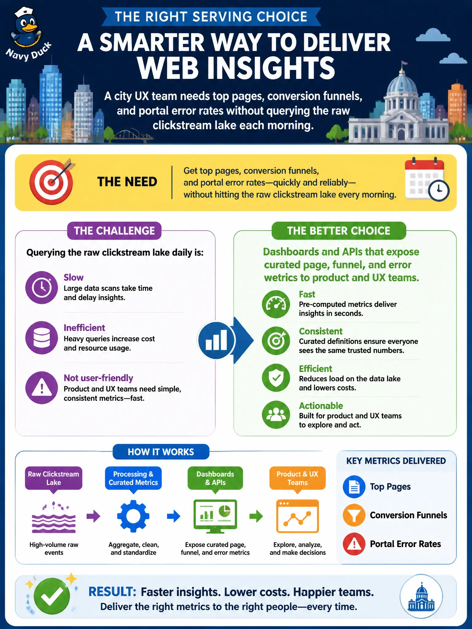
A city UX team needs top pages, conversion funnels, and portal error rates without querying the raw clickstream lake each morning. Which serving choice best fits a municipal web analyzer?
Select an answer to reveal the explanation.
Short Explanation
Dashboards are the storefront, not the warehouse. UX folks need clear top pages, funnel steps, and error spikes without spelunking raw hits. Curated APIs and boards keep the lake for engineers and the answers for the people fixing the portal.
Full Explanation
Dashboards and APIs that expose curated page, funnel, and error metrics give UX and product teams the serving layer they need without querying the raw clickstream lake each morning. Serving curated products is how a municipal web analyzer turns Big Data plumbing into decisions. Chapter 10 closes the loop with consumption suited to civic digital-service teams rather than raw beacon dumps.
Nightly full MapReduce scans of every raw hit emailed to designers dump volume on humans and skip curated serving. Manual spot-checks of server logs by a single editor once per quarter cannot track top pages, funnels, and error rates continuously. Shipping unfiltered beacon payloads to every citizen mailbox confuses transparency with usable product analytics and risks privacy.
Exam caveat: curated metrics must remain explainable—teams should know metric definitions and refresh cadence, or dashboards become contested folklore. Operational check: open the UX dashboard and an API metric endpoint, verify top pages, a funnel step, and an error rate refresh on schedule, and confirm raw-lake credentials are not required for those consumers. Document the verified decision in the municipal architecture runbook so future on-call and audit staff inherit the same standard.