
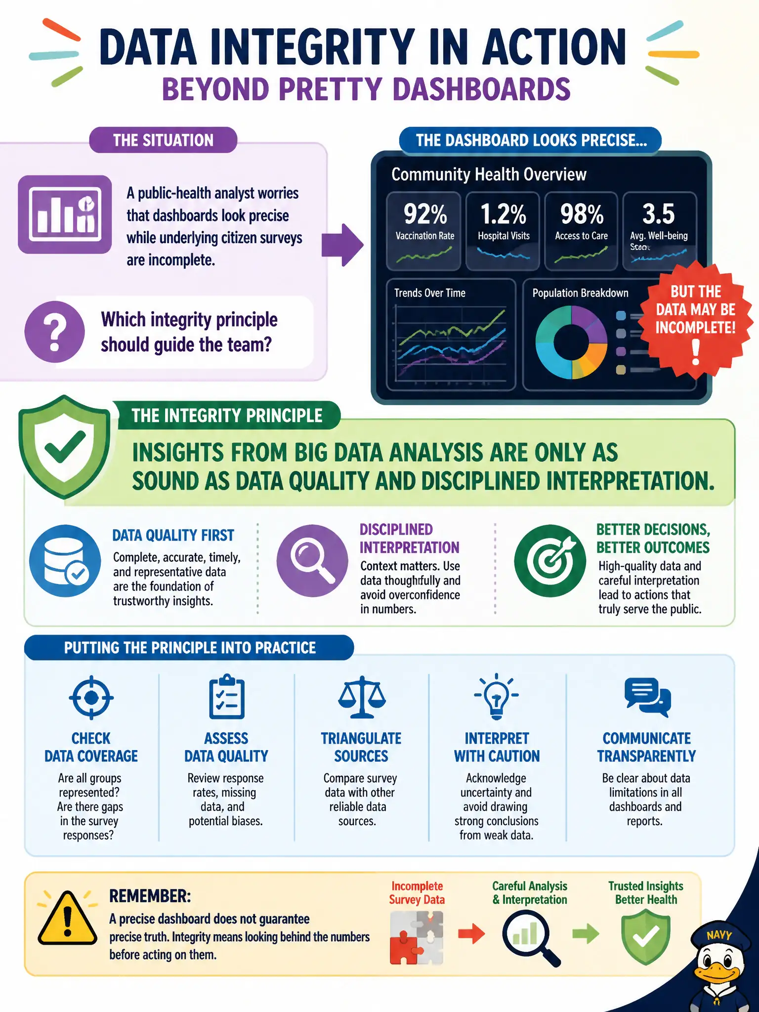
A public-health analyst worries that dashboards look precise while underlying citizen surveys are incomplete. Which integrity principle should guide the team?
Select an answer to reveal the explanation.
Short Explanation
A shiny dashboard can look like a microscope when it is really a funhouse mirror. If the survey sample is holey, the "precise" chart is just decorating the holes. Trust the analysis only as far as the data quality and careful reading go.
Full Explanation
Big Data integrity emphasizes that analytical outputs inherit the quality and interpretation discipline of their inputs. Incomplete citizen surveys introduce uncertainty that visualization polish cannot erase. Public-health dashboards used for civic decisions must therefore treat data quality and disciplined interpretation as first-class controls, not as optional niceties after the chart looks sharp.
Assuming pretty dashboards prove survey completeness fails by concept: presentation is not validation. Believing a major visualization vendor brand fixes incomplete surveys fails by concept: tooling does not invent missing respondents. Publishing every chart immediately so speed replaces validation fails by concept: integrity trades away when release criteria ignore quality.
Exam caveat: Insights are only as sound as data quality and interpretation—vendor logos and visual precision do not substitute for completeness and careful reading of limitations.
Operational check: Document survey response rates and known gaps on each public-health dashboard, require a quality note before publication, and refuse to treat polished visuals as proof that underlying civic survey data are complete. Document residual risk for civic operators and revisit after the next production change window.