
A practitioner needs a deeper understanding of where a trained model is failing on a defined task so improvements can be prioritized. Which approach is most effective for that diagnostic analysis?
Select an answer to reveal the explanation.
Short Explanation and Infographic
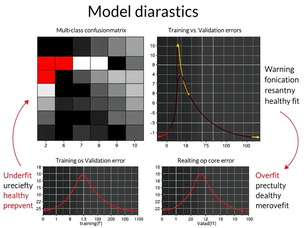
Check this out—when your model is "pretty good" but not good enough, you need a microscope, not another victory lap on the training set. A confusion matrix tells you how you're wrong: which classes get mixed up, whether you're drowning in false positives, who's getting missed. Loss curves tell you the training story: still learning, stuck, or memorizing the training data while validation falls apart. Together they point at the next fix—more data for a rare class, class weights, early stopping, architecture tweaks. Exam trap: re-score the training data and call it analysis. That's looking in a funhouse mirror. Ignoring the test set or shipping blind is worse. Boss walks in asking why recall tanked on class B? You want the matrix and the curves on the table. That's how you prioritize improvements.
Full explanation below image
Full Explanation
In-depth model diagnosis goes beyond quoting a single aggregate score. Aggregate metrics such as overall accuracy can mask severe failures on minority classes, high-cost error types, or unstable training dynamics. Two complementary tools—confusion matrices and loss curves—provide structured insight into where and why a model underperforms so that engineering effort can be prioritized.
A confusion matrix cross-tabulates true labels against predicted labels for classification problems. From it you derive per-class precision, recall, and common confusions (for example, systematically predicting class A when the true class is B). That pattern analysis guides concrete fixes: collect more examples of a confused class, engineer features that separate hard pairs, adjust decision thresholds, or apply cost-sensitive learning. For multi-class tasks, scanning off-diagonal cells is often more actionable than staring at a single accuracy number.
Loss curves plot training and validation loss (and often secondary metrics) against epochs or steps. Healthy curves typically show both losses decreasing, with a modest gap. A large gap where training loss is low but validation loss rises suggests overfitting; both losses staying high suggests underfitting or optimization problems; noisy spikes may indicate batch instability or data quality issues. Reading curves helps decide among more regularization, more capacity, longer training, early stopping, learning-rate changes, or data cleaning.
The correct option combines these analyses: detailed confusion-matrix review plus examination of loss trajectories. That pairing addresses both outcome errors (what the model predicts wrong) and process health (how learning progressed). Ignoring test-set performance and relying on informal demos replaces evidence with anecdote. Re-evaluating only on training data produces overly optimistic results and fails to measure generalization—the quantity that matters for improvement toward production. Deploying without further offline analysis abandons diagnosis entirely.
Best practice is to maintain a held-out or time-based evaluation set, slice metrics by segment (region, device, demographic proxies where appropriate and lawful), and document failure cases for error analysis workshops. For regression, analogs include residual plots and calibration charts rather than confusion matrices, but the principle is the same: structured diagnostics beat single scores. Use findings to form a short improvement backlog—data, labels, features, model, or threshold—then re-measure. For the exam, associate deep performance analysis with confusion matrices and loss curves rather than training-only reruns or skip-the-test shortcuts.