
PROC ASSESS is run with the FITPLOT option on a logistic regression model. What does the FITPLOT calibration plot display?
Select an answer to reveal the explanation.
Short Explanation and Infographic
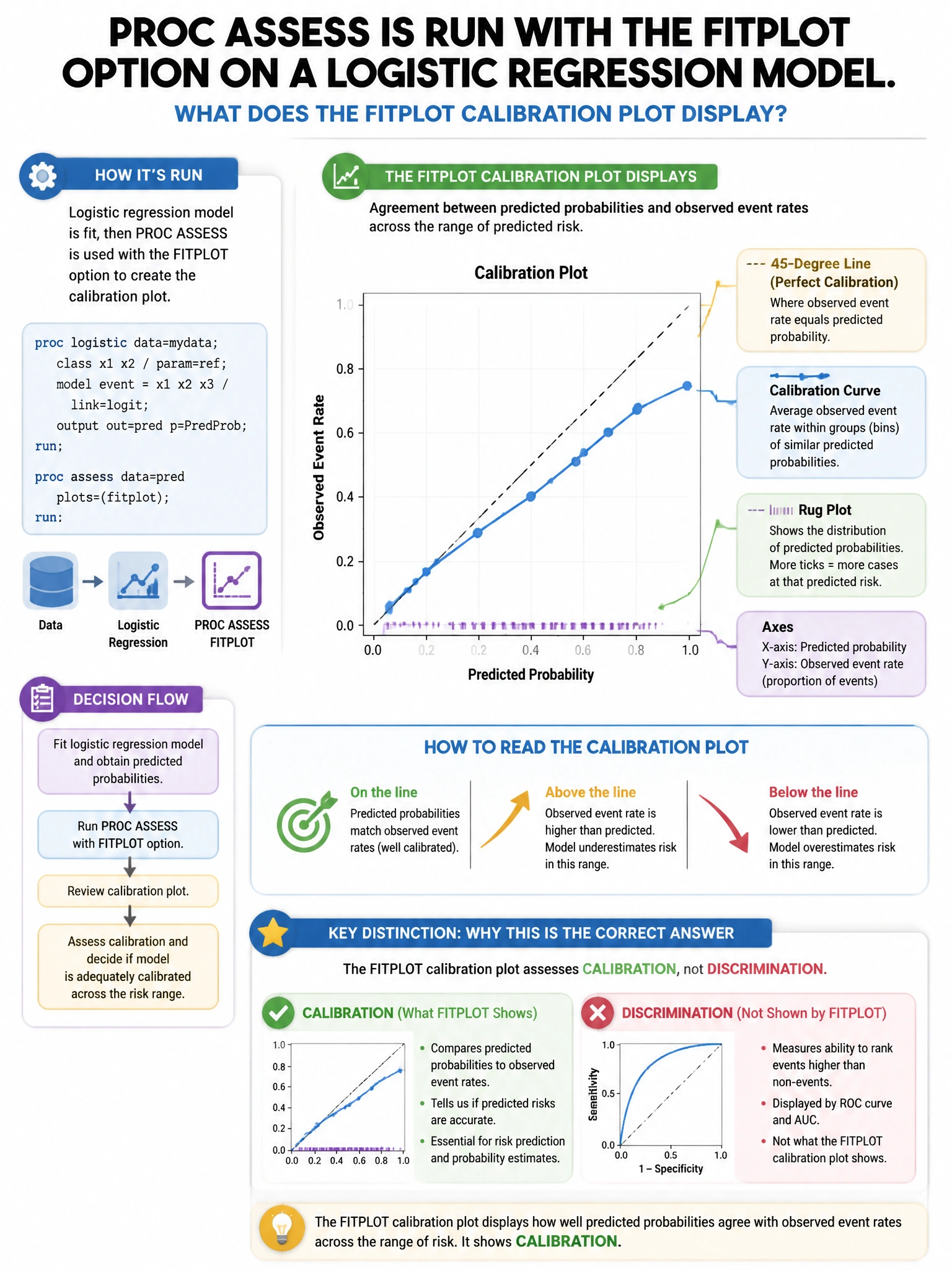
Here's the deal — b is correct because PROC ASSESS's FITPLOT option produces a calibration plot where predictions are grouped into bins, and the observed event rate in each bin is plotted against the mean predicted probability. A well-calibrated model's points align with the 45-degree line (predicted = observed).
Full explanation below image
Full Explanation
B is correct because PROC ASSESS's FITPLOT option produces a calibration plot where predictions are grouped into bins, and the observed event rate in each bin is plotted against the mean predicted probability. A well-calibrated model's points align with the 45-degree line (predicted = observed). A (ROC curve) would be a separate assessment. C (residuals vs. fitted) is for continuous outcomes, not logistic regression. D (gain chart) is produced with the ROCPLOT and FITPLOT options separately, not by FITPLOT alone.