
An AI consulting firm needs to deliver a presentation to corporate executives showing how their new GPU-accelerated recommendation engine performs. They want to host a web-based dashboard where executives can hover over data points, filter results dynamically, and explore multi-dimensional charts in real time. Which two tools or libraries should the development team use to build these custom, interactive web visualizations? (Select two)
Select all correct answers, then click Submit.
Short Explanation and Infographic
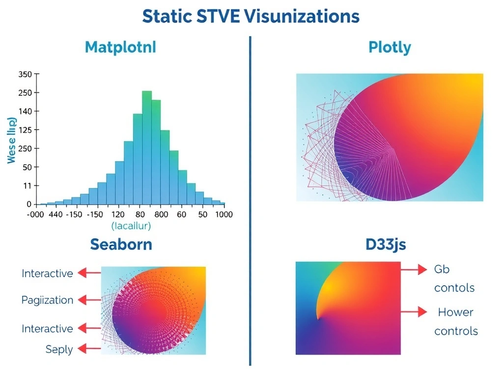
Alright, check this out. If you're building a dashboard for non-technical stakeholders or executives, static charts just won't cut it. They want to click around, filter data, hover for details, and see things move. Matplotlib and Seaborn are fantastic for quick static plots when you're scripting in Jupyter, but they aren't interactive or web-friendly out of the box. TensorBoard is awesome for developers tracking loss curves during training, but it's not a general dashboard tool for business users. To build rich, interactive web visualizations, Plotly and D3.js are the industry standards. Plotly gives you fast interactive charts, and D3.js lets you build whatever custom visual experience you can dream up.
Full explanation below image
Full Explanation
When communicating complex data science and machine learning outcomes to non-technical stakeholders, interactive visualizations are far more effective than static representations. They allow users to self-serve information, drill down into specific data points, and understand complex relationships at their own pace. 1. Plotly is a high-level charting library built on top of d3.js and stack.gl. It allows developers to create beautiful, interactive, web-ready plots (like scatter plots, heatmaps, and 3D charts) using Python, R, or JavaScript with minimal code. These charts support zooming, panning, and hovering right out of the box. 2. D3.js (Data-Driven Documents) is a powerful JavaScript library for manipulating documents based on data. It provides complete control over the Document Object Model (DOM), enabling developers to create highly customized, dynamic, and interactive data visualizations using SVG, HTML5, and CSS. It is the gold standard for custom web-based dashboards. Why the other options are incorrect: Option A (Matplotlib) and Option E (Seaborn) are Python libraries designed primarily for generating static, publication-quality images. While useful for research and exploratory data analysis (EDA), they do not natively support interactive, web-based features like tooltips, dynamic filtering, or transitions. Option C (TensorBoard) is a visualization toolkit specifically designed for tracking machine learning experiment metrics (e.g., loss, accuracy, weight histograms) during training. It is an internal developer tool and is not suitable for presenting polished business intelligence or customer-facing data visualizations to non-technical stakeholders.