Your team is benchmarking a transformer model across a cluster of eight NVIDIA H100 GPUs. Some of the GPUs are suspected of thermal throttling, leading to highly variable response times. You need to present a single visualization that clearly displays the distribution of inference latency for each GPU, specifically highlighting the median latency, variability, and any statistical outliers (extreme latency spikes). Which graphical representation is best suited for this task?
Select an answer to reveal the explanation.
Short Explanation and Infographic
Check this out: when you're troubleshooting performance in a multi-GPU cluster, averages are a total trap. A GPU could have a great 'average' latency, but it might be spiking to five times that latency every few seconds due to thermal throttling or PCIe bottlenecks. You need to see the range, the median, and most importantly, the outliers. That is exactly what a box plot—sometimes called a box-and-whisker plot—is built for. It gives you a nice, clean visual showing the middle 50% of your data (the box), the median line, and those pesky outliers as dots sitting outside the whiskers. If GPU 3 has a box that is twice as tall as the others, or a string of outliers pointing sky-high, you know exactly where to start digging. A line chart showing averages will completely hide those spikes. Heatmaps and scatter plots have their uses, but for comparing statistical distributions and spotting outliers across categories, the box plot is king. Trust me on this one!
Full explanation below image
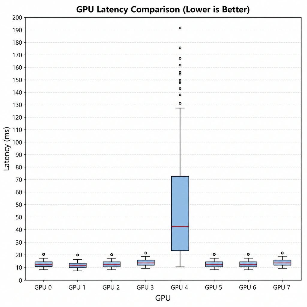
Full Explanation
In performance profiling and systems monitoring, understanding the statistical distribution of performance metrics (like inference latency) is critical. Latency data is rarely normally distributed and often contains significant tail latency or outliers caused by resource contention, thermal throttling, or hardware faults.
A box plot (box-and-whisker plot) is a standardized way of displaying the dataset based on a five-number summary: minimum, first quartile (Q1), median, third quartile (Q3), and maximum. Outliers are typically defined as data points that fall more than 1.5 times the interquartile range (IQR) below Q1 or above Q3, and they are plotted individually as points. When analyzing multiple GPUs side-by-side, box plots allow an engineer to instantly compare the spread (variability), skewness, and median latency of each GPU, making it trivial to spot anomalous hardware that exhibits high tail latency or outlier spikes.
Let's look at the incorrect options: - Option A: A scatter plot showing temperature versus latency might show correlation, but it does not cleanly isolate the distribution profile or easily highlight statistical outliers across multiple distinct categorical entities (different GPUs). - Option B: A stacked area chart shows cumulative values over time, which obscures individual GPU performance profiles and hides outliers within the aggregated totals. - Option D: Heatmaps are useful for representing density or patterns over time, but they do not provide a clear mathematical definition or clean visualization of statistical outliers and quartiles for comparative analysis between discrete hardware nodes.
Thus, side-by-side box plots are the optimal choice for visualizing performance distribution and identifying hardware-specific latency outliers.