
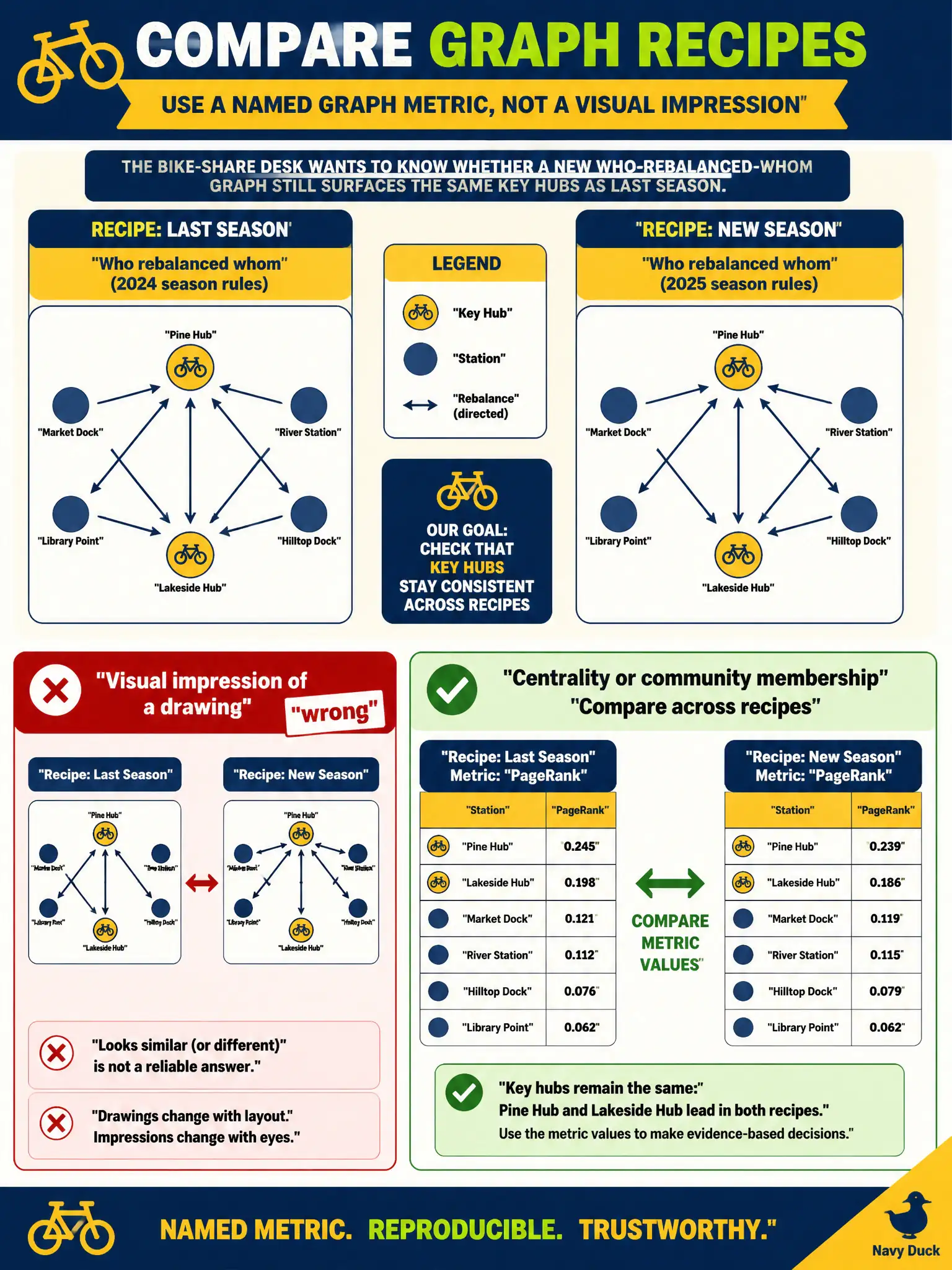
A bike-share desk wants to know whether a new who-rebalanced-whom graph recipe still surfaces the same key hubs as last season. What should be the experimental outcome?
Select an answer to reveal the explanation.
Short Explanation
“Same key hubs as last season” is a named graph metric: centrality or community membership, compared across recipes. A colorful poster, GPU temperature, and a rack walk are impressions, not a score.
Full Explanation
A graph experiment needs a named outcome: path quality, centrality, or community membership. Those metrics can be compared across recipes to see whether the same hubs still appear. A colorful layout, a temperature plot, or a datacenter walk is a visual or ops impression, not a score. The associate skill is to pick the metric before the drawing is admired.