
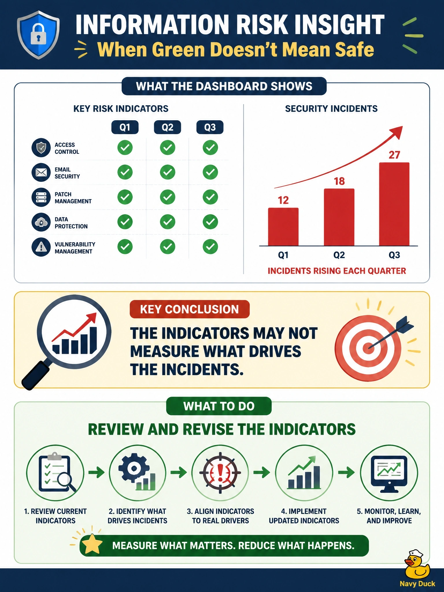
The information risk dashboard has shown every key risk indicator as green for three quarters, yet the number of security incidents has risen in each of those quarters. What should the information security manager conclude and do?
Select an answer to reveal the explanation.
Short Explanation
If your fuel gauge says full while the engine keeps sputtering, you don't trust the gauge harder. Green indicators next to rising incidents tell you you're measuring the wrong things, so you go back and fix the indicators themselves.
Full Explanation
Key risk indicators are only useful if they are correlated with the risks they are meant to signal. When incidents rise steadily while every indicator stays green, the indicators are evidently not tracking the conditions that drive those incidents. The appropriate response is to analyze the incidents' causes, compare them with what the indicators measure, and revise the indicator set, data sources or thresholds so that the dashboard reflects actual exposure. Lowering all thresholds changes colors arbitrarily without improving the relevance of what is measured; an indicator that does not track the right driver remains uninformative at any threshold. Reporting that risk is within appetite would give the board false assurance contradicted by the incident trend, undermining trust in risk reporting. Refreshing the dashboard weekly gives more frequent readings of the same irrelevant measures and does nothing to close the gap. Exam caveat: incidents are a lagging signal, and occasional increases may have other explanations, but a sustained divergence over three quarters points to a measurement problem. Operational check: map each recent incident's root cause to an existing indicator; any cause without a corresponding leading indicator identifies a gap to fill.