
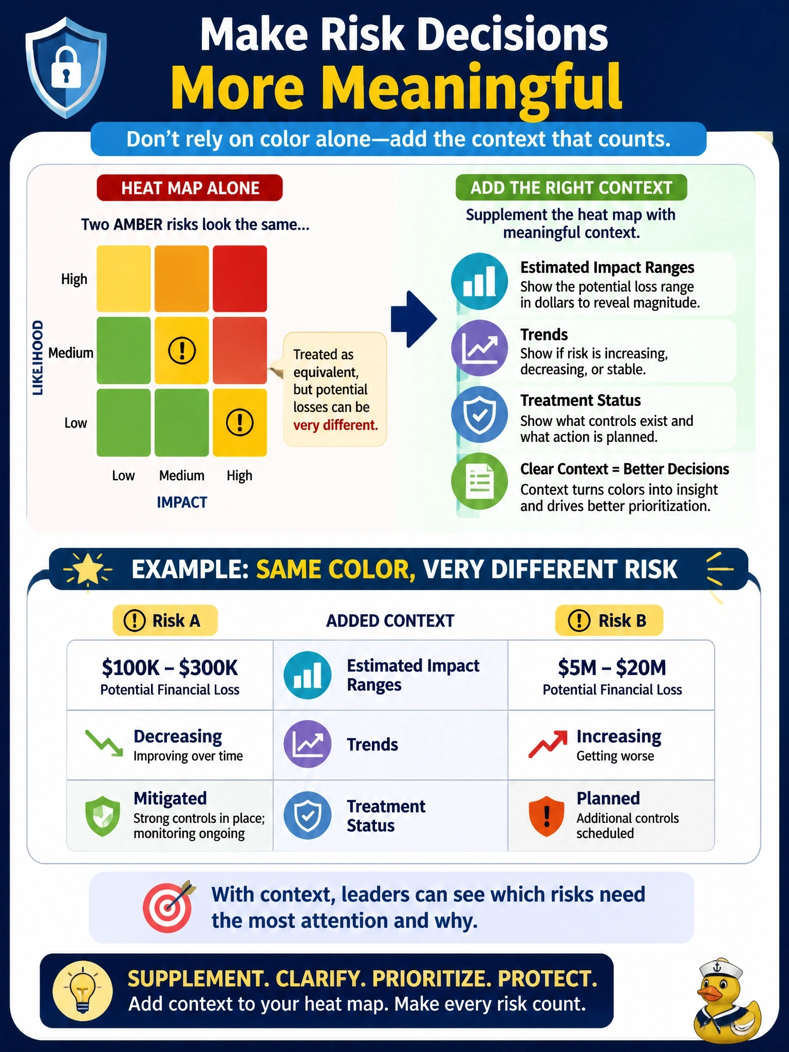
Executives review information risk using only a red-amber-green heat map. In the last meeting they treated two amber risks as equivalent, although one could cause a loss many times larger than the other. What should the information security manager do?
Select an answer to reveal the explanation.
Short Explanation
A heat map is a weather map, not a thermometer: it tells you where it's hot, not exactly how hot. So you keep it for the big picture and add the numbers and context underneath, rather than pretending a color is a measurement.
Full Explanation
Heat maps communicate relative risk quickly, which is why executives value them, but each cell groups risks with very different consequences, and the colors carry no information about magnitude, direction or response. The appropriate fix is to keep the visual summary and supplement it with context: estimated impact ranges in business terms, whether each risk is rising or falling, and where treatment stands. That allows executives to distinguish two amber risks whose potential losses differ greatly. Replacing the map with a single precise score implies a level of accuracy the underlying estimates do not have and can hide uncertainty, creating false confidence. Adding more color bands makes the chart busier while the ratings remain ordinal categories; finer gradation is not measurement. Removing the heat map entirely discards a communication tool that works well for orientation and overreacts to a limitation that context can address. Exam caveat: quantitative analysis can be valuable for the most significant risks, but the point here is that a heat map is a communication aid that needs supporting detail, not a precise measure. Operational check: confirm that each risk shown on the executive heat map is accompanied by an impact estimate, trend arrow and treatment status in the same report.