
An electric transmission company adds many weakly related sensor features to a nearest-neighbor model of transformer faults, and distances between units start to look almost the same. Which description names that problem?
Select an answer to reveal the explanation.
Short Explanation
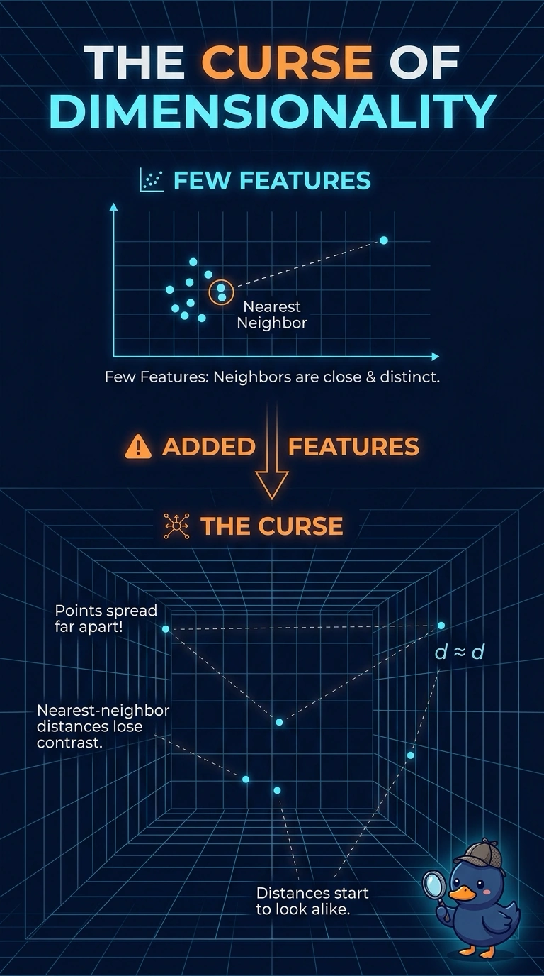
Once you add enough dimensions, everyone in the room looks about equally far from you, and nearest stops meaning much. That flattening is the curse of dimensionality, and the trap is blaming bias, drift, or a rare class for distances that have gone dull. Your neighbor method is losing contrast because the feature list grew.
Full Explanation
Nearest-neighbor methods rely on distances having contrast: the closest units should be noticeably nearer than the rest. As weakly related sensor features are added, points spread through a higher-dimensional space and distances between them concentrate, so the nearest neighbor stops standing out. That loss of contrast as the feature count grows is the curse of dimensionality. High bias is a different failure, in which the model is too rigid to represent patterns that are in the training rows; the symptom here is flat distances, not an overly simple functional form. Concept drift is a change, after deployment, in the relationship between inputs and faults, and the stem describes a distance problem created by adding features, not a shift over time. Class imbalance concerns how rare one fault label is relative to another, which can dominate an error rate, but it does not make pairwise distances look alike. Exam caveat: distance concentration is about the geometry of the feature space, so adding coordinates can hurt a neighbor method even when every new feature is measured cleanly. Operational check: compare typical nearest-neighbor distances with typical distances to other units before and after the extra sensors are included, and look for the gap between them to shrink.