
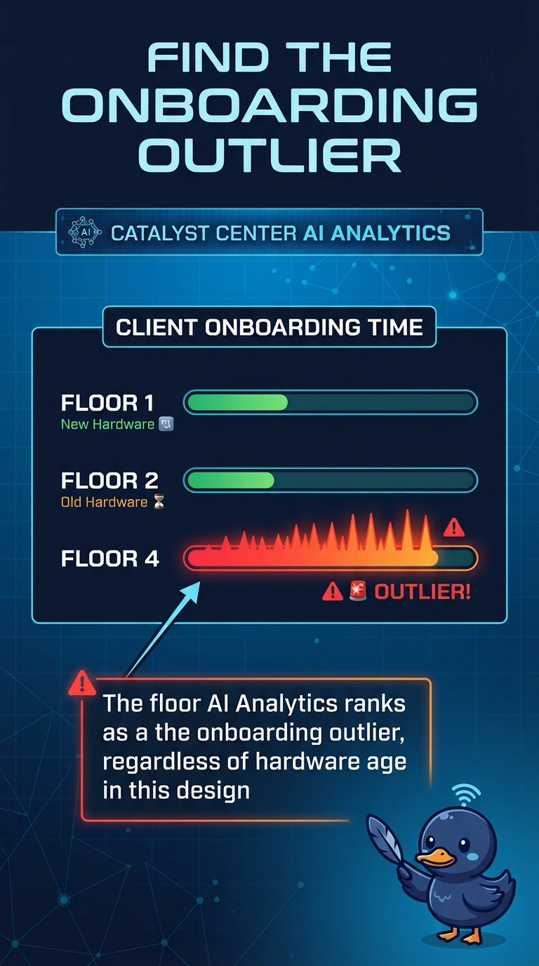
Catalyst Center AI Analytics ranks one hospital floor far worse than the others for client onboarding time. The newest access points are on a different floor that ranks as normal. Where should the team look first?
Select an answer to reveal the explanation.
Short Explanation
The chart already told you which floor is the odd one. Your newest hardware can be healthy and the old floor can be the problem. Start where onboarding actually departed from the rest of the hospital.
Full Explanation
AI Analytics in Catalyst Center compares onboarding experience and highlights the place that is worse than the baseline or the peer floors. The floor ranked as the outlier is the first place to investigate, even when a different floor has newer access points that rank as normal. Age of the hardware is not the ranking. The floor with the newest access points is a reasonable guess and a bad first stop when analytics says that floor is normal. New units do fail, and this ranking says they are not the current onboarding problem. A guest anchor affects guest traffic termination. Onboarding time for the hospital floors is not a property of the DMZ VLAN alone, and the ranking is per floor, not per anchor. The country code is a regulatory setting. It is not an onboarding timer, and analytics is not displaying the regulatory domain as a clock. Exam caveat: the outlier tells you where to look, not which layer is broken. That floor can be slow because of RADIUS, DHCP, or RF. Read the onboarding steps for clients there before you replace access points. Operational check: open the onboarding detail for the worst floor and compare a failed step with the same step on a normal floor.