
An SRE team lead wants to build a custom Instana dashboard showing the P99 response time of the Order Service alongside its error rate, each displayed as a separate time-series chart for trend analysis over a 24-hour window. Which widget type should be added to the custom dashboard for each of these metrics?
Select an answer to reveal the explanation.
Short Explanation and Infographic
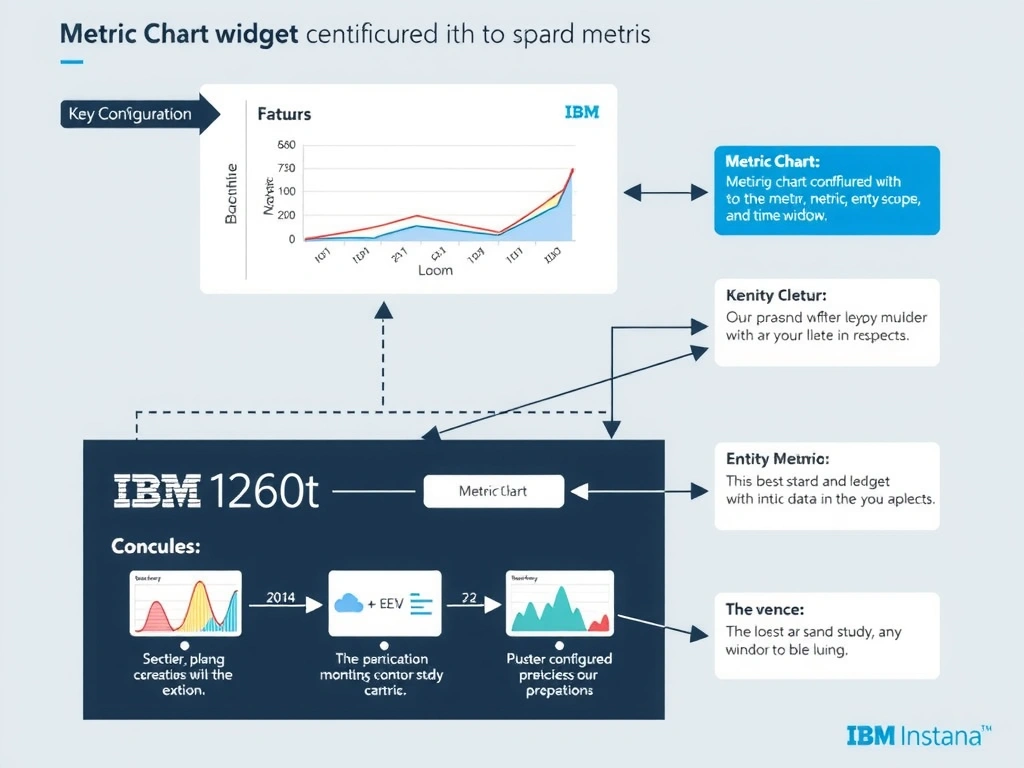
The Metric Chart widget in Instana custom dashboards renders time-series data for configurable metrics including service latency percentiles such as P99 and error rates. Each Metric Chart widget is independently configured with a specific metric, entity or service scope, aggregation method, and time granularity. Multiple Metric Chart widgets can be placed side-by-side on the same dashboard to enable comparative trend analysis.
Full explanation below image
Full Explanation
The Metric Chart widget in Instana custom dashboards renders time-series data for configurable metrics including service latency percentiles such as P99 and error rates. Each Metric Chart widget is independently configured with a specific metric, entity or service scope, aggregation method, and time granularity. Multiple Metric Chart widgets can be placed side-by-side on the same dashboard to enable comparative trend analysis. The correct answer is 'Metric Chart widget configured with the desired metric, entity scope, and time window'. The incorrect options — 'Alert History widget configured to display threshold event counts over time', 'Service Map widget filtered to show only Order Service upstream and downstream dependencies', 'Infrastructure Health widget scoped to the hosts running the Order Service' — are wrong because they do not align with IBM Instana's architecture or recommended practices for this scenario. Understanding this concept is essential for the Domain 2: Configuration domain of the IBM Instana Observability certification.